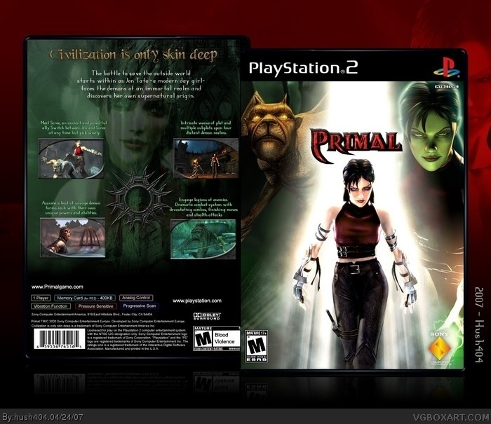
Box... 4? is it? Took me a while to come up with a design I liked. I had something like 4 different designs made up for the cover but in the end liked this one best.
Cred to CrayonMan for the PS2 temp... tho I do have some issues with the quality of it. Meh, w/e just look at the box and ignore any faults you see in the box.
I'd like to point out (if you can't tell) that the back legal/game info section is all done from scratch (excluding logos like the dolby or esrb), as with all of my boxes. I feel it gives it a much nicer effect than slapping in a generic image of another box's back. So... no-one has to ask me "Where'd you get that back piece!??"
Tried something a lil differnt for the background behind the actual case this time, let me know your thoughts on it.
Last thought, after reading the back of the Primal box I found out that the phrase "Civilization is only skin deep" is actually a copyrighted line, owned by Sony!? LOL! Like wtf!?>
the back is pretty much perfect [i love teh headline font, what is it called?] but i dont like the front very much, the art is a little weird, its a bit too bright in that one spot and what #3 said.
nonetheless well made but it doesnt interest me.
#4, Sadly I think that'd a downfall of this site. I find that boxes made for games that people aren't into at the moment (ala halo3 and anything fairly new) it just gets a "meh, I dun care about this game" Which makes the box look bad, when really it's just people lack of interest in the actual game.
Also, I'll work on getting a better frontal 'M' icon, tho I tried a larger Primal title and found it looked really off balance and out of place, thats my reason for having it small, I'll play with it further tho.
Odd you should mention the art from the front, it's all official wallpaper for the game, lol.
Also, the font I used for the back header is called "Beyond Wonderland", not sure where I got it but a google query should yield results.
i like it, and im not familiar with game so i dont know is logo supposed to be that small, but im guessing that you tried not to cover faces, but anyway this is really great box
#6, Thanks. Your right about the logo and me not wanting to cover the faces. Also, I couldn't find a larger version of the logo and when I tried to transform it larger it got rather distorted.
 Primal Box Cover Comments
Box... 4? is it? Took me a while to come up with a design I liked. I had something like 4 different designs made up for the cover but in the end liked this one best.
Cred to CrayonMan for the PS2 temp... tho I do have some issues with the quality of it. Meh, w/e just look at the box and ignore any faults you see in the box.
I'd like to point out (if you can't tell) that the back legal/game info section is all done from scratch (excluding logos like the dolby or esrb), as with all of my boxes. I feel it gives it a much nicer effect than slapping in a generic image of another box's back. So... no-one has to ask me "Where'd you get that back piece!??"
Tried something a lil differnt for the background behind the actual case this time, let me know your thoughts on it.
Last thought, after reading the back of the Primal box I found out that the phrase "Civilization is only skin deep" is actually a copyrighted line, owned by Sony!? LOL! Like wtf!?>
[ Reply ]
looks good my only problem is the low-quality M rating ur using on the front
[ Reply ]
This is awesome except the Primal logo is far too small also the ESRB rating seems a little too small.
[ Reply ]
the back is pretty much perfect [i love teh headline font, what is it called?] but i dont like the front very much, the art is a little weird, its a bit too bright in that one spot and what #3 said.
nonetheless well made but it doesnt interest me.
[ Reply ]
#4, Sadly I think that'd a downfall of this site. I find that boxes made for games that people aren't into at the moment (ala halo3 and anything fairly new) it just gets a "meh, I dun care about this game" Which makes the box look bad, when really it's just people lack of interest in the actual game.
Also, I'll work on getting a better frontal 'M' icon, tho I tried a larger Primal title and found it looked really off balance and out of place, thats my reason for having it small, I'll play with it further tho.
Odd you should mention the art from the front, it's all official wallpaper for the game, lol.
Also, the font I used for the back header is called "Beyond Wonderland", not sure where I got it but a google query should yield results.
[ Reply ]
i like it, and im not familiar with game so i dont know is logo supposed to be that small, but im guessing that you tried not to cover faces, but anyway this is really great box
[ Reply ]
#6, Thanks. Your right about the logo and me not wanting to cover the faces. Also, I couldn't find a larger version of the logo and when I tried to transform it larger it got rather distorted.
[ Reply ]
i like this a lot, i was thinking about doing a primal box but couldnt find the logo/tattoo :( anyway love the artwork fav. :-)
[ Reply ]