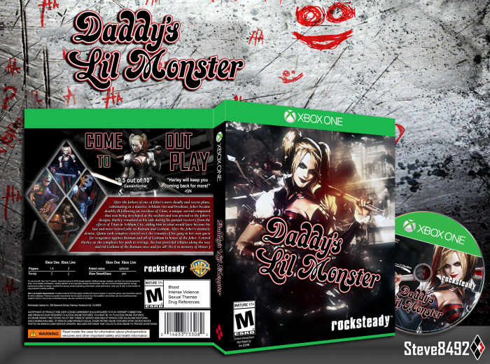
I've come up with some inspiration after a little artistic block. I wanted to do a Harley Quinn spin off game but wasn't sure what direction to go at first. I finally came up with what you see in front of you: Daddy's Lil Monster. Thanks to those who helped in the WiP thread. Printable has also been added. Template, logo, ESRB, etc made by me. Enjoy!
 Daddy's Lil Monster Box Cover Comments
Comment on Steve8492's Daddy's Lil Monster Box Art / Cover.
I really like this! Not a fan of the font used on the synopsis text on the back, but on the whole it's great.
[ Reply ]
Thanks a lot TTR! Means a lot :)
[ Reply ]
The front is neat, but I'm not really a fan of the structure in the back. It's quite textheavy at the moment, and the tagline's font isn't really that good, imo, I'd say if you had used the same one as the one in the logo it could have looked more interesting, and I'd say you could make it the back more lively, seeing as the front has a bit more saturated vibrant colors. It's not bad, but it could be better, in my opinion.
[ Reply ]
I like it,nice. Not fan of screenshots and the font Used on back.
Nice job bro.
[ Reply ]
I think the tagline is kinda weird (arrangement is kinda dodgy), and I think you would have benefited from making the flavour text less and adding a features section below in the same box. Otherwise, you're definitely improving.
[ Reply ]
I don't really feel the front, the back is solid, though.
The styles of Harley are clashing from front to back. The background on both the presentation and on the front is a little distracting, I'd recommend changing the opacity and choose a different background on the front of the box.
[ Reply ]