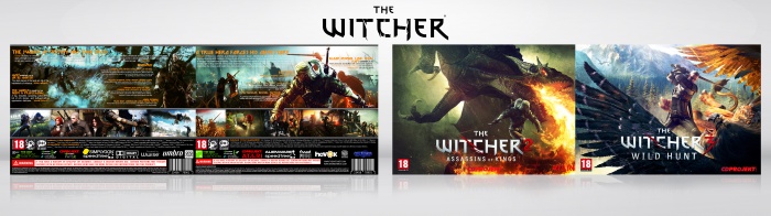
This looks good. I like that you're keeping with your horizontal theme. I only have an issue with the text becoming lost on the back. The text becomes illegible due to the fact they're both very bright. I'd probably add a bit of a drop shadow behind the text in order to bring legibility up.
The other thing I noticed, at least it's much more visible on the thumbnail, is the fact your shades are a bit different on the front and the back. You have more blues and golden yellows in the front, while the back has a green tint to it, causing the blue to look aqua and the golden yellow text to look a bit putrid? Maybe tweak the colors a bit to match the front? Just a thought. Your call.
But overall, this is nice. Again, like the fact you're keeping up with your horizontal theme. It allows some nice compositions when it comes to images, but you always need to keep in mind the length of your text when doing so. I think you broke it down quite well with this take.
 The Witcher Collection Box Cover Comments
great job ...Printable??
[ Reply ]
Thanks :) add soon.
[ Reply ]
@Adam2027 ok thnx
[ Reply ]
@Adam2027 don't give 'em what he asks, it's a waste of your time.
[ Reply ]
This looks good. I like that you're keeping with your horizontal theme. I only have an issue with the text becoming lost on the back. The text becomes illegible due to the fact they're both very bright. I'd probably add a bit of a drop shadow behind the text in order to bring legibility up.
The other thing I noticed, at least it's much more visible on the thumbnail, is the fact your shades are a bit different on the front and the back. You have more blues and golden yellows in the front, while the back has a green tint to it, causing the blue to look aqua and the golden yellow text to look a bit putrid? Maybe tweak the colors a bit to match the front? Just a thought. Your call.
But overall, this is nice. Again, like the fact you're keeping up with your horizontal theme. It allows some nice compositions when it comes to images, but you always need to keep in mind the length of your text when doing so. I think you broke it down quite well with this take.
[ Reply ]
Complate design and colers.
[ Reply ]
good job bro
[ Reply ]
Congrats bro, well deserved . . .
[ Reply ]
congrats mohammad ;) very well deserved ;)
[ Reply ]