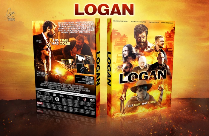
Not really that much of a fan of the summary font used, if I'm seeing correctly it's the Angry Birds font, which I think doesn't really fit with the whole action movie vibe, IMO. Maybe you could mess around a bit with the colors on some of the characters on the front so they fit better with eachother as well. Other than that, I like it.
I like the vibrant overall look of the box and the layout on the back works out nicely.
The lightning on Patrick Stewart in the middle of the front, is a tad strong imo. it could be toned down a bit and it's a bit crowded.
I'm also not sure about the double used tagline and the placement of it (especially on the back it sticks too much on Jackman's chin)
Agree with Frank about the typeface and the vibrancy of Patrick Stewart in the middle that Bastard mentioned. In addition, I think the character and the claws at the bottom may be unnecessary to help with the crowding. Then you can move everything else a bit more down.
There is also a typo in the little caption saying 'The Last of Us MutanTs' That 'T' is missing. I also actually wish you used that same typeface on the captions that you used under 'features'.
The 'His Time Has Come' is kind of really oddly placed. It's floating. I'd consider moving it down so it's closer to the screenshots for balance. You might even be able to get away by tilting it a bit like how you treated the screenshots.
Anyway, nice and bright palette. It gives me a Kill Bill vibe.
 Logan Box Cover Comments
Nice cover, downloadable please?
[ Reply ]
Awesome work as always
[ Reply ]
ty bro ;)
[ Reply ]
Hey I didn't minded your logo
some Persian words I think
It's pretty good
[ Reply ]
yea , ty
[ Reply ]
ahhhhh. So happy thats your back. This site won't be full of daily spam
[ Reply ]
tnx bro , i really happy for back
[ Reply ]
great work also
[ Reply ]
tnx dude
[ Reply ]
hi bro plz creted the cover e3 2017
[ Reply ]
see my pm in forum
[ Reply ]
Not really that much of a fan of the summary font used, if I'm seeing correctly it's the Angry Birds font, which I think doesn't really fit with the whole action movie vibe, IMO. Maybe you could mess around a bit with the colors on some of the characters on the front so they fit better with eachother as well. Other than that, I like it.
[ Reply ]
yea , ty for feedback frank ;)
[ Reply ]
I like the vibrant overall look of the box and the layout on the back works out nicely.
The lightning on Patrick Stewart in the middle of the front, is a tad strong imo. it could be toned down a bit and it's a bit crowded.
I'm also not sure about the double used tagline and the placement of it (especially on the back it sticks too much on Jackman's chin)
[ Reply ]
Agreed.
[ Reply ]
@Bastard ty for feedback bro
[ Reply ]
@jevangod ty
[ Reply ]
Agree with Frank about the typeface and the vibrancy of Patrick Stewart in the middle that Bastard mentioned. In addition, I think the character and the claws at the bottom may be unnecessary to help with the crowding. Then you can move everything else a bit more down.
There is also a typo in the little caption saying 'The Last of Us MutanTs' That 'T' is missing. I also actually wish you used that same typeface on the captions that you used under 'features'.
The 'His Time Has Come' is kind of really oddly placed. It's floating. I'd consider moving it down so it's closer to the screenshots for balance. You might even be able to get away by tilting it a bit like how you treated the screenshots.
Anyway, nice and bright palette. It gives me a Kill Bill vibe.
[ Reply ]
yea right , ty for all
[ Reply ]
wow nice..
[ Reply ]
nice cover here for logan movie
[ Reply ]
ty bro;)
[ Reply ]
this cover is one of the best. :)
[ Reply ]
ty
[ Reply ]
@shiraziha can i have a printable copy of this cover please?
[ Reply ]
@nokzchui sorry
[ Reply ]
nice color and scheme . . .
[ Reply ]
tyyyyyyyy matin ;)
[ Reply ]
Congrats bro . . .
[ Reply ]
ty matin ;)
[ Reply ]
Very well deserved bro
[ Reply ]
ty bro ;)
[ Reply ]