![]() »
»
wow , very hard work . pls send comment ;)
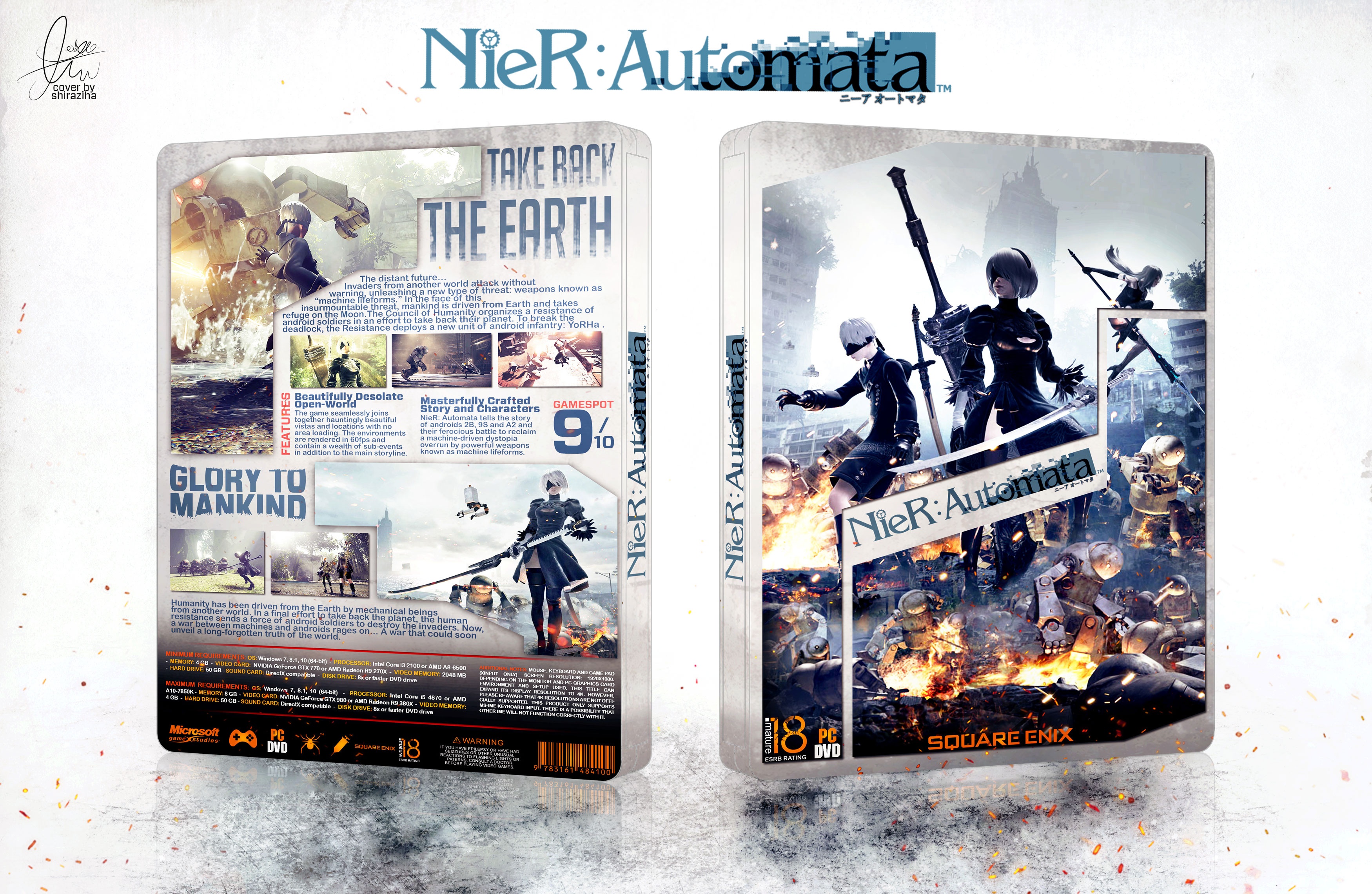
Please See Full Size : 3500*2188
Logo : link
Credit Deividas
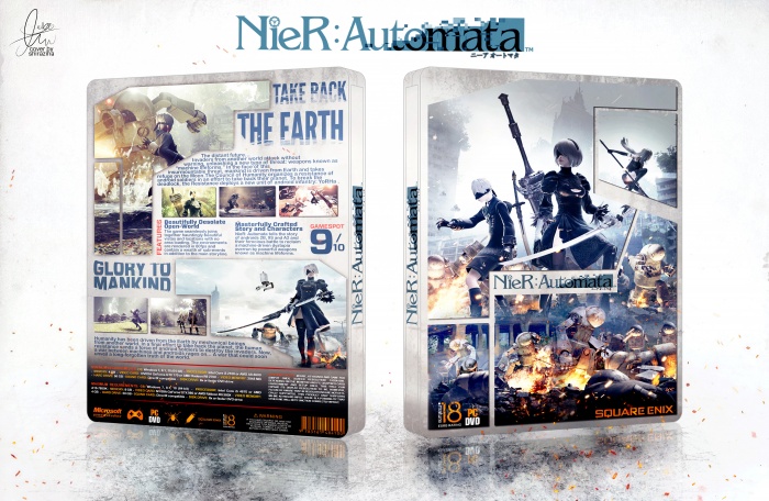
[ Box updated on May 11th, 2017 ] [ original ]
 Nier: Automata Box Cover Comments
Comment on shiraziha's Nier: Automata Box Art / Cover.
Genious! One of your best covers!
[ Reply ]
ty bro ;)
[ Reply ]
amazing
[ Reply ]
ty ;)
[ Reply ]
Great work, what a sophisticated lay out.
[ Reply ]
ty bro ;)
[ Reply ]
Very good. Nice organization and all. Work on the quality next time. The image on the front is kinda blurry.
[ Reply ]
ok , ty for tip ;)
[ Reply ]
Okay I can see some effort, but there's a lot about this I don't like. For starters, the cover is essentially a doppelgänger of Deividas' "Resistance 3 Survivor...." on top of that the quality is subpar. Please don't steal concepts, adapt and curate based on those you like.
[ Reply ]
I didn't even notice that (mainly because I didn't remember, but I looked it up just now), but you're right. The composition is essentially identical of his Resistance 3 box (link.
It's really not cool to steal layout concepts. I understand finding inspiration, but the cover layout is essentially identical as is the top half of your box. :(
[ Reply ]
@Martiniii332 It is good to take idea from anyone else designs. I liked that design. I gave created to him. I didn't steal it if I does I never gave created to him . I dont need stealing cuz there is nothing in the end of this way I just like that design but anyone have thier opnion I respet to yours. And I couldnt find better quality image for front if you had it send me. Thanks
[ Reply ]
@Martiniii332 if send for me best quality i change idea front , ty again
[ Reply ]
@lucidhalos i just like idea him lucid , not more
[ Reply ]
@Martiniii332 and @lucidhalos . update cover
[ Reply ]
The composition of this is superb, but the low quality in the front kills me as does the typeface chosen for the summary text. I would consider finding a better resolution of the image on the front and updating it. Additionally, I think you should look into expanding your typeface selection. You tend to favor the same ones I've noted. I'd look into some of these typefaces which may work well with this:
League Gothic, Noto Sans, Aileron, Clear Sans, Ubuntu (my personal suggestion). They're all free to download typefaces, but of high quality because some are offered through Google Fonts.
But anyway, the color on this is nice. The break down of content is well executed. It just needs some refinement.
[ Reply ]
ty lucid . update cover and change typface . and ty for font name , i use font league gothic ;)
[ Reply ]
Update cover
[ Reply ]
Congrats Amin :)
[ Reply ]
ty bro ;)
[ Reply ]
Brilliant artwork.
Looks exactly like I would expect a futuristic RPG from Square Enix to look like. Much deserved HOF!
[ Reply ]
ty bro ;)
[ Reply ]
100 of 100.
[ Reply ]
ty ;)
[ Reply ]
but how to download this...???
[ Reply ]