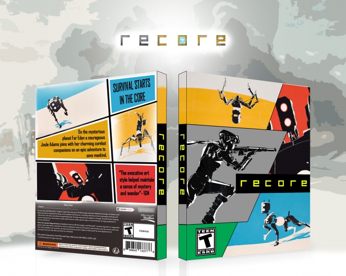
Went for a broken glass minimalist approach, collected the images by taking screenshots from the trailer. Used cutout filter on the background images. Haven't Uploaded a cover for a while and been meaning to do it for weeks but been busy.
[ Box updated on June 10th, 2017 ] [ original ]
 ReCore Box Cover Comments
Comment on GoldenCraig008's ReCore Box Art / Cover.

I really like what you've done with the front. I just think it would look better, if you continued what you've started on the front (the shapes and colors, only change the 'RP' rating to a 'T' to match the back rating) and also applied that on the back of the box (imo. the cutout filter doesn't look as good, as the black/white characters with the colored background from the front) I also think it needs a bit more info (like a header, game features and a review quote/score) it has a lot of potential though.
[ Reply ]
Thanks a lot, i was thinking something similar but i didn't have a visual idea of how to do it. I'll take on all of your advice and suggestions and will get around to updating it throughout the next few days.
[ Reply ]
I would have liked to see that nice colour on the front be on the back too.
[ Reply ]
Nice update, it definitely looks better this way imo.
[ Reply ]
The overall layout is cool, but I'm a bit irked by the Red Dead Redemption styled font on the back. It feels sort of out of place. Something more modern/simplistic would work better IMO, and for the description preferably a font with lowercase letters.
[ Reply ]
Thanks for the feedback. i'll update it soon.
[ Reply ]
That's more like it.
[ Reply ]
New design.
[ Reply ]