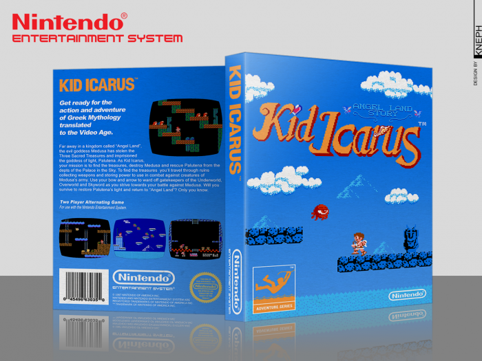
Kinda what I was going for: make use of the in-game assets and keep it simple.
In terms of actual work, it wasn't so simple though. Had to do pixel art to adapt everything to the cover size and keep the resolution high, and edit a bunch of labels to look more modern and high-rez, and edit the fonts to keep them as close as possible to the original.
 Kid Icarus Box Cover Comments
Not bad! I like how it looks, I just think the front is a bit empty. It still looks cool though. Good work!
[ Reply ]
Thx! :)
[ Reply ]
Great work! Wow!
[ Reply ]
Thx man! :) No favorite though? ;P
[ Reply ]
Nice and simple.
[ Reply ]
Kinda what I was going for: make use of the in-game assets and keep it simple.
In terms of actual work, it wasn't so simple though. Had to do pixel art to adapt everything to the cover size and keep the resolution high, and edit a bunch of labels to look more modern and high-rez, and edit the fonts to keep them as close as possible to the original.
[ Reply ]
I like this a lot. Really keeping with the retro feel. Plus, it includes Pit, my favorite smash brother!
[ Reply ]
Thx!! Yeah, really love Pit also :)
[ Reply ]
That looks fantastic, especially the front cover.
[ Reply ]
Thx!
[ Reply ]