While it does look nice, it's kinda frowned upon to use wallpapers as a main image unless heavily edited... From a design point it all looks quite neat and tidy. I would have just used a dark font on the back for the description text instead of white with the dropshadow. Always find dropshadows to be quite ugly. Could just be me though
 Mad Max Box Cover Comments
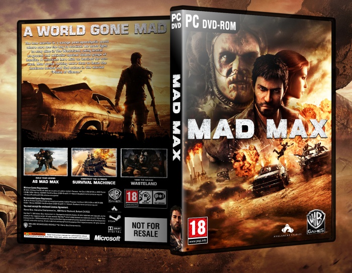
I really liked front looks very cool. you made it yourself or this wallpaper?
[ Reply ]
The front is poster of the game, but finding a high quality version of it was difficult
[ Reply ]
@FIRE13spotty I agree with you sometimes it takes more time to find and prepare suitable material than to create the cover itself...
[ Reply ]
Looks rad dude
[ Reply ]
Thanks dude!
[ Reply ]
While it does look nice, it's kinda frowned upon to use wallpapers as a main image unless heavily edited... From a design point it all looks quite neat and tidy. I would have just used a dark font on the back for the description text instead of white with the dropshadow. Always find dropshadows to be quite ugly. Could just be me though
[ Reply ]