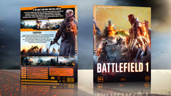
Good colour scheme, the back is a really nice layout, very clean well done. Maybe make the summary text black instead of white, be easier to read as it's on the light background.
The front is cool, but the render of the 3 people on the right over the single person, I'd either get rid of, it looks a bit randomly placed. Or move it to the back over the explosion in the bit of empty space left on the front.
 Battlefield 1 Box Cover Comments
Good colour scheme, the back is a really nice layout, very clean well done. Maybe make the summary text black instead of white, be easier to read as it's on the light background.
The front is cool, but the render of the 3 people on the right over the single person, I'd either get rid of, it looks a bit randomly placed. Or move it to the back over the explosion in the bit of empty space left on the front.
[ Reply ]
thanks.
[ Reply ]
front not match and back very basic . back not idea. not good style text , and overall not good
[ Reply ]
hmm, thanks for suggestion.
[ Reply ]
Not a fan of the back to be honest, the text layout and the futuristic style shapes.
The front is aight, however what Vince already said pretty much what I have to say. Also don't forgot to replace the Ubisoft logos with EA and DICE.
[ Reply ]
updated.
[ Reply ]
GOOD GOOD ! VERY GOOD !
[ Reply ]
thanks.
[ Reply ]
Nice one dude!
[ Reply ]
thanks.
[ Reply ]
OMG thats awesome! Can you please, please, add to printable!???
[ Reply ]
added.
[ Reply ]
printable added.
[ Reply ]
nice work.
[ Reply ]
nice work.
[ Reply ]