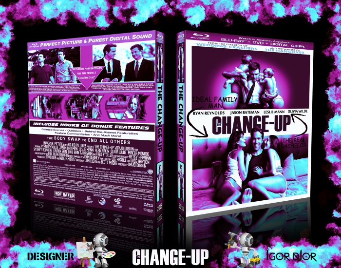
There's very little creativity here. It's essentially the original artwork with a gradient map on top of everything like normal, and it actually makes certain things invisible, like the text on the front that says "Ideal family man" and "The real bachelor". It just shows laziness rather than attention to detail. Plus, comic sans? really?
You're capable of much better. You just need to stop using gradient maps in every single piece you do.
Uploading 4 covers that are exactly the same minus the colour scheme they have doesn't merit much in the grand scheme of things, and all it really does is knock other peoples artwork further and further out of sight, which is unfair.
What you're doing is a good way to get yourself banned and have all of your "artwork" removed from the site. You should make boxes more original and make them your own. Look at some of our high ranking member's boxes and you'll get an idea of what we look for on this site.
What you are doing is a good way to force yourself to ban and remove all of your "works of art" from the site.
1.I break some rules of the site???? Or I insult someone?????
2.I think it will be against the rules.though.. if to you and BenBrownDesign this action gives confidence then I do not mind it.
You should make boxes more original and make them your own.
3.I must make boxes similar to yours???? it's disgusting to look at them!!!
Look at some of our high ranking member's boxes and you'll get an idea of what we look for on this site.
4.I thought on this site all are equal !!!! but it turns out that there are high-ranking members.)))))))))) PS:I do not care about high-ranking members...
It is quite similar to the official case, but different enough I guess. I actually quite like this colour.
Few bits of feedback:
I would be to be careful where you place text. You have that little bit on the front "Ideal family man" which is hard to read cause its black text on black.
For the back, try not to make your text so small, but also give text breathing room so it doesn't seem so cramped.
Its only on the presentation and not on the box itself, but you could try playing with some new textures.
I have to agree with Ben though. You're capable of better. Even if "better" still uses gradients. You have enough talent to do more and be more creative.
 The Change-Up Box Cover Comments
fun and funny movie. so I decided to do it...
[ Reply ]
Not a fan, dude.
There's very little creativity here. It's essentially the original artwork with a gradient map on top of everything like normal, and it actually makes certain things invisible, like the text on the front that says "Ideal family man" and "The real bachelor". It just shows laziness rather than attention to detail. Plus, comic sans? really?
You're capable of much better. You just need to stop using gradient maps in every single piece you do.
Uploading 4 covers that are exactly the same minus the colour scheme they have doesn't merit much in the grand scheme of things, and all it really does is knock other peoples artwork further and further out of sight, which is unfair.
[ Reply ]
hey, dude, in the end we're living in a free country?please can i do what I like?or is it a problem?
PS:I'm tired of listening to your pointless discussions I do not care about them. I did and will continue to do what I like...
[ Reply ]
@Wolfenstein The Old
"PS:I'm tired of listening to your pointless discussions I do not care about them. I did and will continue to do what I like..."
Okay, then don't ask anybody to give you feedback anymore.
[ Reply ]
@BenBrownDesign Okay,
[ Reply ]
@Wolfenstein The Old
What you're doing is a good way to get yourself banned and have all of your "artwork" removed from the site. You should make boxes more original and make them your own. Look at some of our high ranking member's boxes and you'll get an idea of what we look for on this site.
[ Reply ]
@Steve8492
What you are doing is a good way to force yourself to ban and remove all of your "works of art" from the site.
1.I break some rules of the site???? Or I insult someone?????
2.I think it will be against the rules.though.. if to you and BenBrownDesign this action gives confidence then I do not mind it.
You should make boxes more original and make them your own.
3.I must make boxes similar to yours???? it's disgusting to look at them!!!
Look at some of our high ranking member's boxes and you'll get an idea of what we look for on this site.
4.I thought on this site all are equal !!!! but it turns out that there are high-ranking members.)))))))))) PS:I do not care about high-ranking members...
[ Reply ]
It is quite similar to the official case, but different enough I guess. I actually quite like this colour.
Few bits of feedback:
I would be to be careful where you place text. You have that little bit on the front "Ideal family man" which is hard to read cause its black text on black.
For the back, try not to make your text so small, but also give text breathing room so it doesn't seem so cramped.
Its only on the presentation and not on the box itself, but you could try playing with some new textures.
I have to agree with Ben though. You're capable of better. Even if "better" still uses gradients. You have enough talent to do more and be more creative.
[ Reply ]
thank you so much for the feedback I really appreciate every word you say...)
[ Reply ]