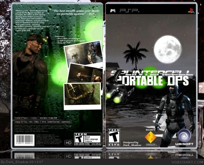
good, but the goggles cover the logo and the text on the back is too small and the back just has an empty feeling, but its not that bad at all, pretty good, 4/5
i think its alright, but there is a bit too much empty space going on. also with those ps3 stats, this game would be one incredible game for a portable.
 Tom Clancy's Splinter Cell: Portable OPS Box Cover Comments
It took me so much time to do!! hope you like and I think it's my best!
Plz leaves comments and ratings
[ Reply ]
Oh and plz view in full before you leave comments
[ Reply ]
good, but the goggles cover the logo and the text on the back is too small and the back just has an empty feeling, but its not that bad at all, pretty good, 4/5
[ Reply ]
i think its alright, but there is a bit too much empty space going on. also with those ps3 stats, this game would be one incredible game for a portable.
[ Reply ]
the goggles are poorly cut out, use some fancy fonts on the back and apply some effects. Also, move screensots to the left.
3.5/5
[ Reply ]
#3 thx but for the text view in full and on all the original box the text on the back is pretty small
#4 thx shady but for the stats it's because I wasn't able to find a PSP back so I took those one
# 5 thx again and the font I used is the best I found so if you could suggest me another one it would be nice
and credit to : koopadasher for the logo and ffseer22/crayonman for the temp
[ Reply ]
i like how you put the goggles on the logo. its creative. great job on the box.
[ Reply ]
#7,
[ Reply ]
#7 thx and I'll move the google to the left a little bit so I'll upgrade it maybe today or tommorow!
[ Reply ]
#7 i like it how koopadasher put the goggles on the logo. it's creative.
[ Reply ]
#10, I put the google on the logo not koopa O_o
[ Reply ]
#11 um... you did?
[ Reply ]
yes of course I'll move it to left and I'll upgrade look
[ Reply ]