#6, haha, very good point, lol. =X
Anyways, the box is great, the front is really cool.
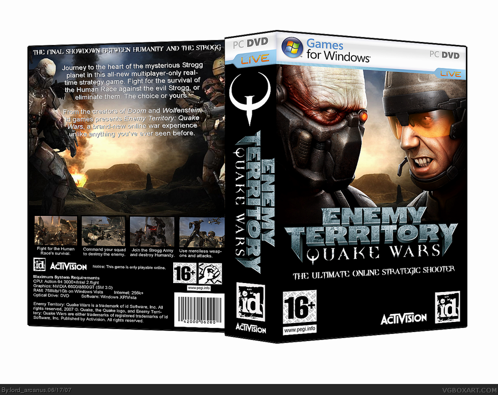
I think the text on the back could have been moved a little down towards the center so it seems less "top heavy" so to speak. But still a very great box.
#10, that was only once. spike does that all the time. and the back isn't really empty. it's not fair how people should automatically give him a 5/5 when in fact not all of his boxes are perfect, for same that one.
#11, Arcanus last time I checked your box is even thicker than most of Mad Spike's, and a lot of his thick boxes are Special/ Limited Editions. So I have to disagree with your comparison.
Besides I think this should be just about your box, not about nitpicking others' to promote your own.
#11, when you try to copy someone's style youll always fail. Just come up with your own unique style and youll be getting only perfect scores. Check out my boxes - i use my own template, i make boxes in my own style and i get 5/5 point almost every time. This is wnat i am talking about.
Heh. So many posts about me...
I have only few thick boxes. But I delete almost all of them. Now there is only the Splinter Cell box. link
All my other boxes is a double pack. I don't think they are thick.
I use collectors and special editions feature to make box more special and real. Also I am trying to use some uncommon arts in my design.
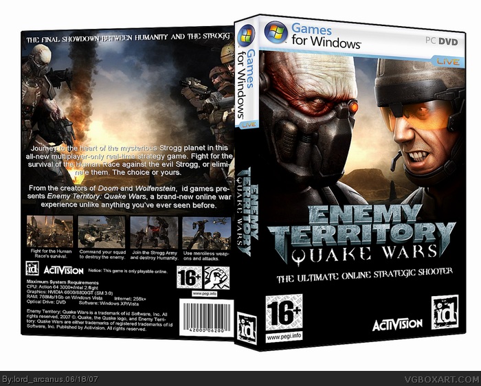
This box is definatly should have a special edition tag or something.
 Enemy Territory: Quake Wars Box Cover Comments
hi.
i was kinda going for a Mad Spike style with this, i hope you don't mind.
I put a helluva lot of effort into this, so be fair.
kthnxbaii
[ Reply ]
5/5
[ Reply ]
#2 would you care to give any comments?
[ Reply ]
I like it alot ! 5/5.
[ Reply ]
I think it should be some kind Of special edition considering how large it is. It's pretty good though.
[ Reply ]
#5, yet no one says that to Mad Spike...
[ Reply ]
I like front cover. ID logo rulez %D
[ Reply ]
#6, haha, very good point, lol. =X
Anyways, the box is great, the front is really cool.
I think the text on the back could have been moved a little down towards the center so it seems less "top heavy" so to speak. But still a very great box.
[ Reply ]
Well, kinda nice try to make something Mad-Spike-style. However too much empty space on the back.
[ Reply ]
#6, link Well me and Timmeh did.
[ Reply ]
#10, that was only once. spike does that all the time. and the back isn't really empty. it's not fair how people should automatically give him a 5/5 when in fact not all of his boxes are perfect, for same that one.
[ Reply ]
#11, Arcanus last time I checked your box is even thicker than most of Mad Spike's, and a lot of his thick boxes are Special/ Limited Editions. So I have to disagree with your comparison.
Besides I think this should be just about your box, not about nitpicking others' to promote your own.
Edited at 1 decade ago
[ Reply ]
MadSpike uses Double Pack in Imandix. This is a bit big. But it is very nice :)
[ Reply ]
nice one. the only thing is that i probably would've formatted/arranged the summary better.
[ Reply ]
#11, when you try to copy someone's style youll always fail. Just come up with your own unique style and youll be getting only perfect scores. Check out my boxes - i use my own template, i make boxes in my own style and i get 5/5 point almost every time. This is wnat i am talking about.
Relax.
Edited at 1 decade ago
[ Reply ]
looks great but you need to replace the white with something. looks really good seriously.
[ Reply ]
Heh. So many posts about me...
I have only few thick boxes. But I delete almost all of them. Now there is only the Splinter Cell box.
link
All my other boxes is a double pack. I don't think they are thick.
I use collectors and special editions feature to make box more special and real. Also I am trying to use some uncommon arts in my design.
This box is definatly should have a special edition tag or something.
[ Reply ]
well, all I can say is that it is very good..
[ Reply ]
This is one of those boxes that have inspired me.
+fav
[ Reply ]
#19, thank you very much, although i hate seeing my old boxes.
[ Reply ]