this is neato. i don't see anything wrong with it.
i might have made the figures on the front fill up the space a bit more because most of them is covered by the logo, but that's just a matter of opinion, everything is niice.
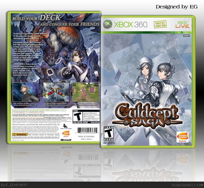
I think there is too many empty space on the front. Also I can't see the legs of the girl. I think characters should be little bigger.
I love the back cover. Colors are great and great art. Only bad thing is that text blocks the face of this monster little bit.
I can't say now that this box is one of my favorite, but it should be in the Hall Of Fame. No doubt.
#7, Thanks, the girl has got a grey dress so that's why you can't see her legs. Those characters were already like that on the original art. I put the characters into the cards though.
 Culdcept Saga Box Cover Comments
Please check full-size, thanks.
[ Reply ]
Very nice. I dont really see anything wrong with it.
[ Reply ]
That's awesome.
[ Reply ]
looks very nice, too much opacity on the reflection though.
[ Reply ]
I'm happy with the reflection, I think it's subtle and that's how I want it. Also thanks.
[ Reply ]
#4, too much? you should see mine hehe...
this is neato. i don't see anything wrong with it.
i might have made the figures on the front fill up the space a bit more because most of them is covered by the logo, but that's just a matter of opinion, everything is niice.
[ Reply ]
I think there is too many empty space on the front. Also I can't see the legs of the girl. I think characters should be little bigger.
I love the back cover. Colors are great and great art. Only bad thing is that text blocks the face of this monster little bit.
I can't say now that this box is one of my favorite, but it should be in the Hall Of Fame. No doubt.
[ Reply ]
very nice box.
[ Reply ]
#7, Thanks, the girl has got a grey dress so that's why you can't see her legs. Those characters were already like that on the original art. I put the characters into the cards though.
[ Reply ]
#9, Damn this dress. Ppl need more legs :D LOL :)
BTW, community is very silent today.
Edited at 1 decade ago
[ Reply ]
#10, I agree.
[ Reply ]
Sorry for double-commenting, but is this better or not?
[ Reply ]
#12, actually, no... the characters look all stretched now.
[ Reply ]
#13, That's what I thought, just making sure, changed back now.
[ Reply ]
awesome, I love both the back and front designs. 5/5 and fav
[ Reply ]
how did i miss this?
this has to be one of my faves from you so far.
great work!
[ Reply ]
Wow, very nice.
[ Reply ]
Thanks
[ Reply ]
i can't believe i never saw this box, great work. although i've never heard of this game. but still, 5/5
Edited at 1 decade ago
[ Reply ]
This is nearly close to being in the hall :D. Well thanks for the favorites.
[ Reply ]
Is this the box that started all this anime hate
[ Reply ]
idk, but the box itself looks well designed. awesome job E_G. fav
[ Reply ]
Simply amazing!!! I just think the text on the bottom of the back can be just a little clearer, but that doesn't really matter! Fav.
[ Reply ]
looks very official
Edited at 1 decade ago
[ Reply ]
<3
[ Reply ]