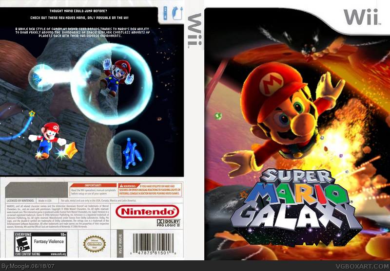
Well this is my second box art. I worked hard on it. Id like to thank all my friends for the support, and I tried to be differnt from all the boxes and pick images that stood out. Thankyou. ^^ Credits: Thanks Ash for the Font, and for getting rid of a black spot that wouldnt go away xD and Justin for the support
I don't like it - at all. You're missing dev logos and a rating on the front, the Mario render is stretched and ... looks weird.
There's nothing on the spine ... the back is just a single screenshot with a render and some text, and the text needs some changing, btw. I would use a different font. The template isn't very good, either.
The front is good. But the back is too plain, and the letters are too small. Maybe you could use more screenshots? And the logo on the spine is placed incorrectly. Also, it needs to be a bit bigger. Good for a second though. 2.5/5.

 Super Mario Galaxy Box Cover Comments
Well this is my second box art. I worked hard on it. Id like to thank all my friends for the support, and I tried to be differnt from all the boxes and pick images that stood out. Thankyou. ^^ Credits: Thanks Ash for the Font, and for getting rid of a black spot that wouldnt go away xD and Justin for the support
Edited at 1 decade ago
[ Reply ]
Wow, a different type of box, you can tell how hard it was to find those images.
[ Reply ]
#2 Thanks ^_^
[ Reply ]
while it is pretty amzing your lacking a lot of stuff, logo on the soine, dev logo, esrb logo
[ Reply ]
#4, *spine
[ Reply ]
#4 I see your point. Ill update it ^^.
[ Reply ]
Umm...
I don't like it - at all. You're missing dev logos and a rating on the front, the Mario render is stretched and ... looks weird.
There's nothing on the spine ... the back is just a single screenshot with a render and some text, and the text needs some changing, btw. I would use a different font. The template isn't very good, either.
You just need some practice. :)
Edited at 1 decade ago
[ Reply ]
#5, Use the edit functionality please.
[ Reply ]
There we go updated! ^_^
Edited at 1 decade ago
[ Reply ]
Spine logo is facing the wrong way. Dev and rating look good though. ;)
BTW, which program are you using?
Edited at 1 decade ago
[ Reply ]
Sorry mom stole the computer, thankyou though.
#10 Paint shop Pro X.
Edited at 1 decade ago
[ Reply ]
The front is good. But the back is too plain, and the letters are too small. Maybe you could use more screenshots? And the logo on the spine is placed incorrectly. Also, it needs to be a bit bigger. Good for a second though. 2.5/5.
[ Reply ]
Thankyou #12
[ Reply ]
good job moogle!
[ Reply ]
Thanks #14 =D
[ Reply ]
Re-updated with all the advice taken. Looks better?
[ Reply ]