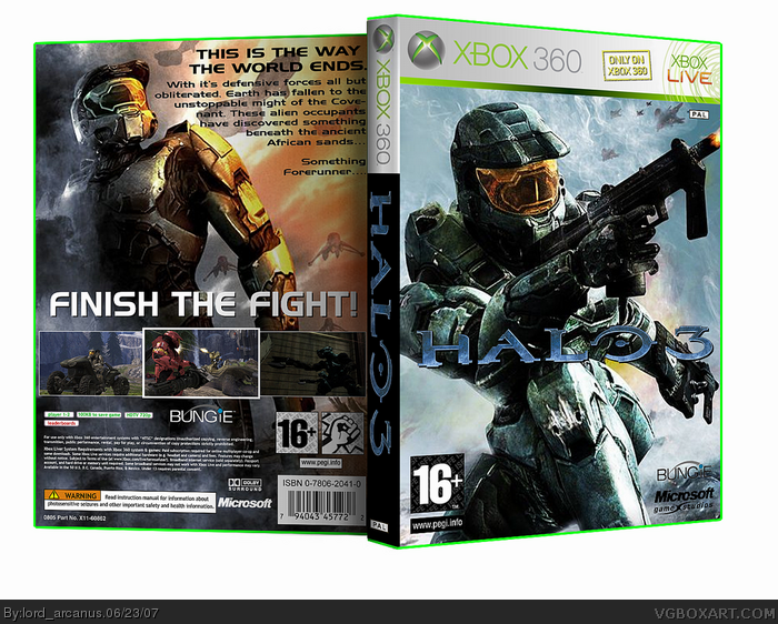
i'm so sorry. I saw the new pics. I had to use them. I couldn't stop myself. People were calling out to me! "Haaallllooooo 3...." i couldn't control myself. so i had to do this. sorry.
don't give me any of your "wallpaper = no effort = phail" bullsh*t, because i put quite a bit of effort into this, as well as editing the template.
Not too shabby though the spine is just flat out out boring and takes away from the box a bit. The plastic is also too light but I won't take away because of that.
I haven't seen the new pics yet, other than on this box, so I don't know if the grainy effect was added by you or not, but it looks sort of weird like that. But still a great box, the back is quiet nice and the front is also great, but I think the logo could stand out just a little bit more.
#1, Actually what's wrong with just using a wallpaper without really editing extremely much? If the wallpaper is badly edited it looks amateur-done. If you just use the official wallpaper (which many companys does) and use it as the box, then it still looks professionally.
 Halo 3 Box Cover Comments
i'm so sorry. I saw the new pics. I had to use them. I couldn't stop myself. People were calling out to me! "Haaallllooooo 3...." i couldn't control myself. so i had to do this. sorry.
don't give me any of your "wallpaper = no effort = phail" bullsh*t, because i put quite a bit of effort into this, as well as editing the template.
[ Reply ]
Not too shabby though the spine is just flat out out boring and takes away from the box a bit. The plastic is also too light but I won't take away because of that.
4/5. Fix spine for 4.5/5.
[ Reply ]
looks cool man, you make a box in 2 secs, when i finish mine i look at it for 2 weeks and think what is wrong with it lol.
[ Reply ]
it's really good..but you should of used halo 3 mc..
5/5
[ Reply ]
Nice job, i don't like the back because it feels to empty 4/5.
[ Reply ]
really good job 5.5/5
Edited at 1 decade ago
[ Reply ]
AHAHA halo 3 has 360 boxes!
kthnxbai.
Edited at 1 decade ago
[ Reply ]
I haven't seen the new pics yet, other than on this box, so I don't know if the grainy effect was added by you or not, but it looks sort of weird like that. But still a great box, the back is quiet nice and the front is also great, but I think the logo could stand out just a little bit more.
[ Reply ]
#8, i agree with RB
[ Reply ]
i figured someone would try and use the new pics as soon as they came out...i also agree with Icefox.
[ Reply ]
Can I have a link to this new material??
[ Reply ]
#11, yea, I'd like to see this to...
[ Reply ]
#11, Same here . Give us a Link please :) !
[ Reply ]
#11, #13, it's not that hard to find... :D
i'll pm you, because i know that some trolls with just start spam attacks with it. ;)
[ Reply ]
i know..i got alot..and they have em at ign.com
[ Reply ]
#14, yeah, look at the main page, look what u started...:(
[ Reply ]
wow, it's nice. Good job. *is off to see the pix*
[ Reply ]
nice, cool box. (goes to ign...) oh yeah, fav
[ Reply ]
Nice, dude.
5/5
[ Reply ]
how did you get those somke effects on the back?
[ Reply ]
#1, Actually what's wrong with just using a wallpaper without really editing extremely much? If the wallpaper is badly edited it looks amateur-done. If you just use the official wallpaper (which many companys does) and use it as the box, then it still looks professionally.
[ Reply ]
#7, XDDDDDDDDDDDDDDDDD
[ Reply ]
Oh, by the way, this box is grand.
[ Reply ]