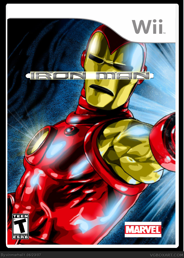
The logo shouldn't cover his face and it needs to be cut out better. I don't think that white is part of it. Also, cut out the Marvel logo. Use the wand tool.
ok this is version 2. i have a felling i want to delete this one because its worse. also, no matter how i tried, i couldnt cut out the marvel logo. i geuss its probably a 2/5. the iron man logo looks crummy, too
 Iron Man Box Cover Comments
ok, lasdt box for the day (cough)
i used gimp
plz rate
[ Reply ]
The logo shouldn't cover his face and it needs to be cut out better. I don't think that white is part of it. Also, cut out the Marvel logo. Use the wand tool.
[ Reply ]
ok, tomorrow, i will probably have an update. ( the white was part of te logo)
[ Reply ]
it is a sweet picture but just move the title cut out the marvel logo and make the teen logo a bit bigger
[ Reply ]
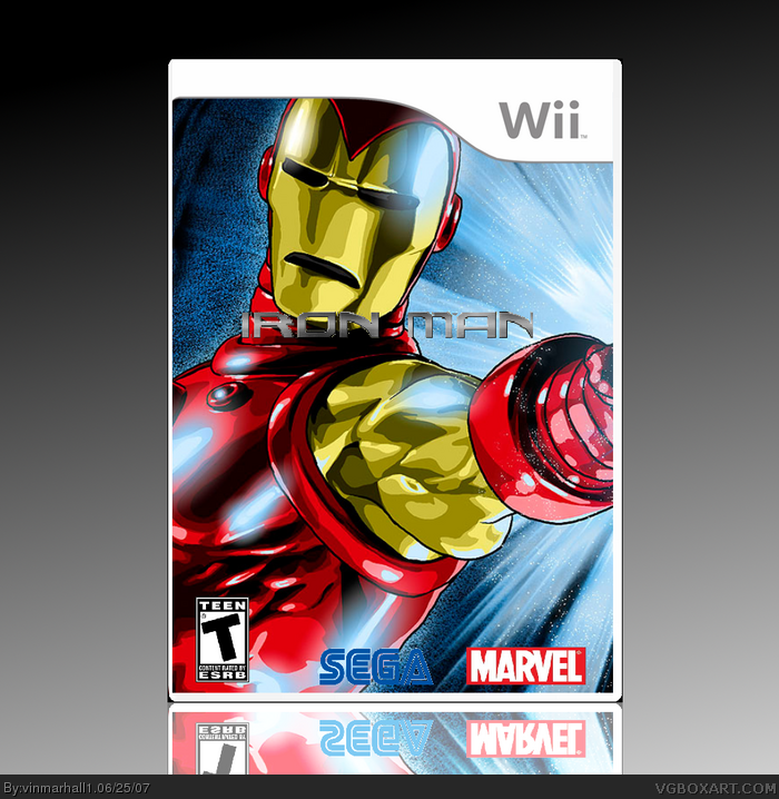
add a Sega logo. (the Iron Man game is being published by Sega)
[ Reply ]
ok, i will begin to work on version 2
[ Reply ]
ok this is version 2. i have a felling i want to delete this one because its worse. also, no matter how i tried, i couldnt cut out the marvel logo. i geuss its probably a 2/5. the iron man logo looks crummy, too
[ Reply ]
Use the wand tool, the stick with a glowy tip next to the select by color tool, to get rid of the white bars on the marvel logo.
[ Reply ]
ok, last update. (probably)
ok, i fixed the marvel logo, and the iron man logo (may look bad)
[ Reply ]
"Touch my strong arm"
[ Reply ]
Edited at 1 decade ago
[ Reply ]
ok, finally fixed the whole thing. took me an 30 min. so how do ulike it?
[ Reply ]
Looks nice, just make the Iron Man logo bit biger.
[ Reply ]
ok, i made it bigger ^_^ ( 2 hours ago)
[ Reply ]
Looks lot better 4/5
[ Reply ]
thank you. highest ive ever got on a box.
[ Reply ]
id been experimenting a lot wit gimp, so i made it 3d with a reflection
Edited at 1 decade ago
[ Reply ]
how do you make reflections with gimp?!
[ Reply ]
go to layers and fix the contrast(first copy image, fli p it, and put it under box. blend wont work )
[ Reply ]
i made the box a little bit smaller (2 hours ago)
[ Reply ]
OKAY THANKS
[ Reply ]
fixed the refecdtion (im tired of the updates)
please rate the box again now that i am fully done
Edited at 1 decade ago
[ Reply ]
the sega logo isn't cut out right. ricardo posted one in the first page of box material, simple needs.
[ Reply ]
thats where i got it
[ Reply ]
Under no circumstances should a box be updated that much
[ Reply ]
Maybe you could post things in the forums for critiques?
[ Reply ]
well i wont update it any more. this has got to be the record for box updates =P
[ Reply ]