Well,
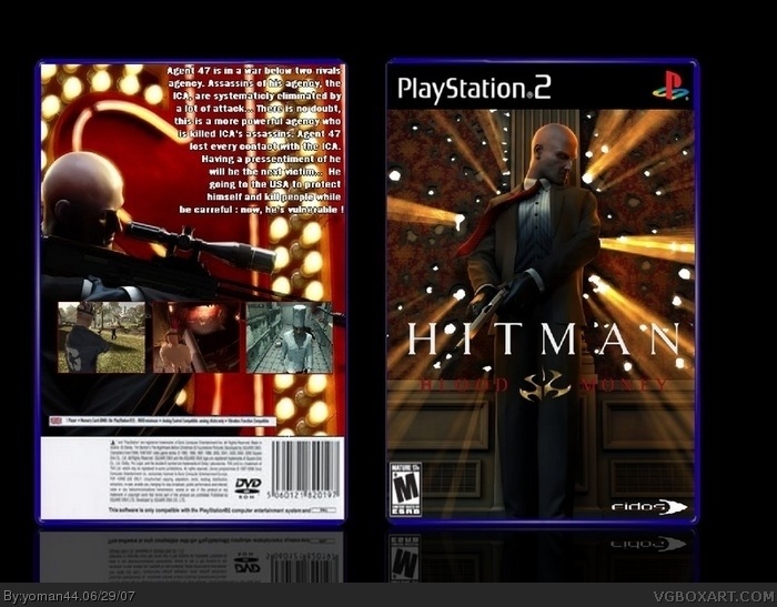
It's good but the subtitle "Blood Money" is a little bit hard to see, try to change the color of it. The bottom logos are blurry and the eidos logo is badly cut out.
So, 3/5
as #2 said.. blood money is hard to read, eidos is bad
M rating is stretched, on the back the screenshots just dont fit and you should put more work in your box 2/5 but you could do a lot better :P I'm sure of it !!
 Hitman: Blood Money Box Cover Comments
I hope you like it
[ Reply ]
Well,
It's good but the subtitle "Blood Money" is a little bit hard to see, try to change the color of it. The bottom logos are blurry and the eidos logo is badly cut out.
So, 3/5
[ Reply ]
as #2 said.. blood money is hard to read, eidos is bad
M rating is stretched, on the back the screenshots just dont fit and you should put more work in your box 2/5 but you could do a lot better :P I'm sure of it !!
[ Reply ]
#3, I try, I try... And thanks you for your confidence
Edited at 1 decade ago
[ Reply ]
i like the front alot, other than the fact that you cant read blood money, but other than that I like it... 4/5
[ Reply ]