Now thats what i call NICE. The box feels full and complete. However, the most bad thing is...that the art had been used for many many many many many many many many many many many many times. Well, i think ill add this to fav because its very nice for a first try.
#2, i'd have to disagree. to me, it just seems like its a few pics with words on the back.
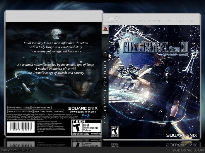
it doesnt seem complete because it doesn't have screens w/ captions or a headline or stuff like that and also, the front image is not the bext quality, particularly because it is a screenshot.
a few flaws are also that the teen logo is too small and the square enix logo should have red in the E's.
Thanks for the advice, I was unsure on how to present the back cover. Initially I was going to do the screenshot and caption layout but instead I copied the text from the FFXIII Versus trailer and blended a few screens. I agree that there should be a headline/title as well.
Hopefully my second attempt at box art will be a bit more well rounded and complete.
 Final Fantasy Versus XIII Box Cover Comments
Thanks to HellKnight for the template.
Many thanks as well to the other box art here that helped inspire me to produce this piece.
My first attempt at box art, relatively happy with the outcome but know I can improve on it.
Edited at 1 decade ago
[ Reply ]
Now thats what i call NICE. The box feels full and complete. However, the most bad thing is...that the art had been used for many many many many many many many many many many many many times. Well, i think ill add this to fav because its very nice for a first try.
[ Reply ]
Thank you! It's difficult to find high quality art for this game as so little is released, hopefully that'll change with time.
Edited at 1 decade ago
[ Reply ]
Probably the best first I've ever seen. Keep it up.
[ Reply ]
I feel like making a box for this game now XD Very nice, favorited.
[ Reply ]
#2, i'd have to disagree. to me, it just seems like its a few pics with words on the back.
it doesnt seem complete because it doesn't have screens w/ captions or a headline or stuff like that and also, the front image is not the bext quality, particularly because it is a screenshot.
a few flaws are also that the teen logo is too small and the square enix logo should have red in the E's.
[ Reply ]
Thanks for the advice, I was unsure on how to present the back cover. Initially I was going to do the screenshot and caption layout but instead I copied the text from the FFXIII Versus trailer and blended a few screens. I agree that there should be a headline/title as well.
Hopefully my second attempt at box art will be a bit more well rounded and complete.
[ Reply ]