i kinda dislike it.
it looks, reasonable, but there's almost no text on back, and you've used a wallpaper twice, without editing[as far as i can see], also, the back wallpaper[zoomed in] seems blurry.
2/5 for effort[seemingly no effort.]
3.5/5 for box.
 Heatseeker Box Cover Comments
thanks crayon man for the temp.
[ Reply ]
hope you like it
[ Reply ]
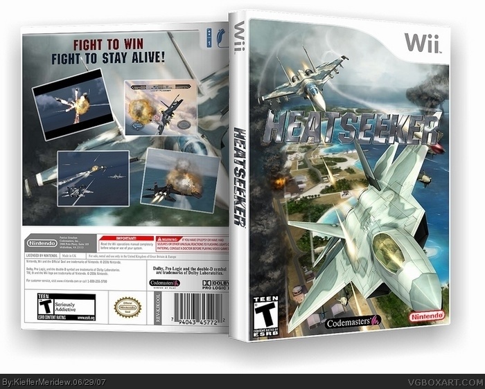
That's good but I think the back is too empty. Needs more texts (gameplay descriptions and story).
[ Reply ]
wow this box is really cool man.. but he big plane on the backside is the same as the one on the front page
[ Reply ]
i kinda dislike it.
it looks, reasonable, but there's almost no text on back, and you've used a wallpaper twice, without editing[as far as i can see], also, the back wallpaper[zoomed in] seems blurry.
2/5 for effort[seemingly no effort.]
3.5/5 for box.
[ Reply ]