![]() »
»
[ Box updated on July 3rd, 2007 ] [ original ]
 Tom Clancy's Splinter Cell: Conviction Box Cover Comments
Comment on dmshaposv's Tom Clancy's Splinter Cell: Conviction Box Art / Cover.
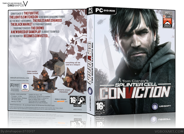
Really liked how some of it turned out....BTW this is the FIRST Splinter Cell Conviction box for the PC.Hope you like it! :)
[ Reply ]
Very awesome 1000/5
Must be in Hall of fame^^
[ Reply ]
It's freaking superb. It's made in my style (I mean, I like this style and I use it too). It looks very stylish. Only thing I don't like it's a screenshots inside the leafs. But colors are great and so on :)
+Fav
[ Reply ]
Absolutely great, but for some reason I don't like the guy being on the spine, I'm not sure why.
[ Reply ]
#4, I agree :)
[ Reply ]
@ #4, I admit that I wasn't going to put him there - feels like he's floasting in mid-air in context to front image. But if you imagine browsing through your game collection and see the spine only - "oh its a game with Sam fisher makeover".
A lot of official boxarts have the spine with the charcater included to stand out in a collection. That's why I kept it. ;)
But of course, I respect your opinion...and thanks for the +favs, guys. :)
[ Reply ]
realy good 5/5
[ Reply ]
Very nice.
The screenshots in the leaves is a great idea, though I feel like they are a bit too obscured. But overall, good stuff.
[ Reply ]
Bad thing, that there is not so many ppl notice this box :) I think this one deserve Hall Of Fame.
[ Reply ]
here's some suggestions.
-sam fisher on the front looks a tiny bit squished, try making him a bit wider. (just a few pixels)
-make the 16+ and PEGI violence ratings on the back into a black colour, so they are easier to see.
If you can do that, i will give a 5/5 and add this to favourites.
[ Reply ]
@#8,#9 and #10
Thanks for the Suggestions.Mostly on official boxes they use the white PEGI, but I'll see if black looks better. As for Sam looks squished - well that happened in distorting the 3D image, he was very wide in the actual 2D shot. I'll check that.
BTW thanks for the vote of confidence Mad spike, I hope other people also realize the great effort put into this box...
[ Reply ]
i actually like sam fisher on the spine, it looks cool
[ Reply ]
i actually like sam fisher on the spine, it looks cool
[ Reply ]
woah. this is wonderful. great job, russian DJ!
the leaf screenshots are like... gorgeous...
[ Reply ]
#11, And you think, I am some animal? Do not trust all that write:)
I not often add boxes in fav. At me the criteria and they strict enough. So, this box is very good. You have an excellent skills of design.
[ Reply ]
#14, russian DJ? O.O
[ Reply ]
This is amazing, definitely deserves hall of fame. You got my fav.
[ Reply ]
Update:
- Higher resolution so that you guys can notice even the slightest details (even the credition!)
- fixed the sidebar, lowered the opacity on sam.
- fixed PEGI
[ Reply ]
Awesome job, this should be in the hall of fame . 5/5
[ Reply ]
Hall of Fame.
[ Reply ]
@#13, #14 and #15
Thanks finalfantaseer, I really was experimenting with those leaves there and I kinda liked the effect myself. I try hard not to repeat the same style and think of new and original ones.
@ mad spike, I didn't exactly get what you said - however I can imagine you to be a very tough critic since you really put an unnatural ammount of care and detail to your own boxes and they are easily some of the best on this site. :)
...and fantaseer thinks I'm some russian DJ cuz of my name - which really is meaningless. :P
[ Reply ]
#21, I don't get about a russian DJ... (
I am Ukrainian (and it's kind a similar to russians) but I didn't get it :D
____________________
Oh, now I get it.
Letters "SH" (its an one letter in russian language) and "V" makes this name sounds a bit like rus. But there is no such unreadeble words in russian language as this nick :D LOL
Edited at 1 decade ago
[ Reply ]
if this doesn't make it into the hall of fame, i'm going to eat my own fingers.
[ Reply ]
#23, I am thinking about to remove it from my fav if you it your fingers :D LOL, JK :D
[ Reply ]
#23, Don't eat the fingers just yet - only 3 more to go. kthxbye :P
[ Reply ]
I love being the last one to favourite before it gets in the Hall :p. Good job!
[ Reply ]
Thanks lodovicok. :)
[ Reply ]
sam really needs a shave.
[ Reply ]
#28, Why do you think so? LOL
Edited at 1 decade ago
[ Reply ]
I love it! 1000000000000000000000000000000000/5...hehe
[ Reply ]
love the screen shots!
[ Reply ]
The first thing I noticed was the comonly forggoten "Tom Clancey's" side bar. But that's no big deal. I really like the unique twisting angle you put on the cover art. And the faded picture on the back cover is coll too. 9/10
[ Reply ]
Nice
[ Reply ]