Killzone 2 - finally uploaded and finished. Credit to sockeymonkey for the template.
This one took me a while - I hope you guys like it. there's a chance I'll end up doing a special edition - sorry for making you re-comment it so many times but I've been having technical troubles! Here's the final submission.
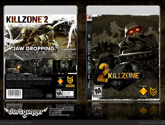
This is actually really cool. I just think it may look better if the two was straightened out and placed next to the E in Killzone.
But great box either way.
#2, i agree, bout time you showed us your not just some image stealing troll spammer :) very nice box indeed, my only complaint is the ps3 sidebar, the one you used isnt the real one. :\ o also i think turning the white background on the front to black would also be an improvement. but all in all, good job.
#3, haha, thanks... i think! yeah, the sidebar is the wrong one. I'll fix it later. i like it with the white borders - when turned to black, they're nearly impossible to see. plus, when they're white, it makes it sync better with the back.
This turned out nice. I like how you intigrated the Killzone 2 logo on the front cover. The big is friggin nuts man great job. 5/5 and a +fav from me. KEEP IT UP!!!
 Killzone 2 Box Cover Comments
Killzone 2 - finally uploaded and finished. Credit to sockeymonkey for the template.
This one took me a while - I hope you guys like it. there's a chance I'll end up doing a special edition - sorry for making you re-comment it so many times but I've been having technical troubles! Here's the final submission.
[ Reply ]
This is actually really cool. I just think it may look better if the two was straightened out and placed next to the E in Killzone.
But great box either way.
[ Reply ]
#2, i agree, bout time you showed us your not just some image stealing troll spammer :) very nice box indeed, my only complaint is the ps3 sidebar, the one you used isnt the real one. :\ o also i think turning the white background on the front to black would also be an improvement. but all in all, good job.
[ Reply ]
#3, haha, thanks... i think! yeah, the sidebar is the wrong one. I'll fix it later. i like it with the white borders - when turned to black, they're nearly impossible to see. plus, when they're white, it makes it sync better with the back.
Edited at 1 decade ago
[ Reply ]
Very very good.
[ Reply ]
is this in the hof yet?
[ Reply ]
Great job 5/5.
[ Reply ]
#6, Haha, nope, not enough favorites
[ Reply ]
Probably your best boxart so far, I like the back a lot, however, I'm not a big fan of the white border on the front. great box still....I fav
Edited at 1 decade ago
[ Reply ]
this is incredible. just incredible.
[ Reply ]
seven faves, thanks guys! I hope this can get into the hall but it was submitted at a bad time so people might not notice it...
[ Reply ]
Back cover is superb.
[ Reply ]
This turned out nice. I like how you intigrated the Killzone 2 logo on the front cover. The big is friggin nuts man great job. 5/5 and a +fav from me. KEEP IT UP!!!
[ Reply ]
#13, the big? haha i guess you mean the back... thanks!
[ Reply ]
Fourteen favorites. Thanks everyone :)
[ Reply ]
#14, no i hink he means back ground
[ Reply ]
Wow, hall of fame. This is awesome!
[ Reply ]
woah. i didnt realize how completely fucking awesome this is!
so artistic and brilliant.
definately takes the lead in terms of style.
i love it!
[ Reply ]
Wicked pretty much summed it up right thur... You're pretty amazing.
Psst, could someone prime me on that whole Black 2 dealio? e___e
[ Reply ]
Those dog tags are the ones in the MGS 20th anniversary logo. Good box overall
[ Reply ]
the back rocks
[ Reply ]