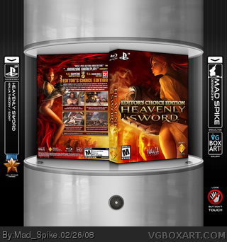
One more magnificent exclusive game for consoles. You all know how I don't like Official PS3 Template. Therefore my Heavenly Sword will be in a large box - special editor's choice edition ;)
Enjoy!
Comments and adding to favorites are welcome:)
#7. Yes, and so is changing the template from the norm. Though I do agree that it could use something to better differenciate it from a PC box. You'd think it was PC unless you're paying fairly close attention.
Edit: Mad Spike, what happened to your sweet page banner?
I think its good, but definitly not one of your best. i also dont really like the way the "editor choice edition" looks,but its still overall good. i was gonna make this game for my next, but the material is somewhat limited and i didnt want to use the same images everybody else used.
I am glad that I found some new pics to use them. I fade characters by my self. I made a background, and many more.
#16 Looks like I have too many "enemies" so this want be easy :D LOL
 Heavenly Sword Box Cover Comments
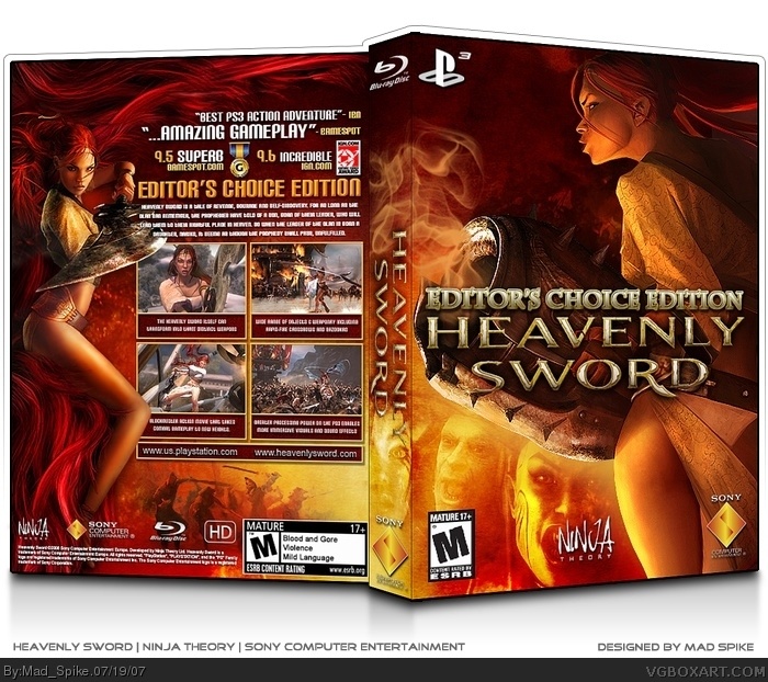
One more magnificent exclusive game for consoles. You all know how I don't like Official PS3 Template. Therefore my Heavenly Sword will be in a large box - special editor's choice edition ;)
Enjoy!
Comments and adding to favorites are welcome:)
[ Reply ]
This is sick :B +fav
[ Reply ]
hmm it's really good, but i really dislike how it barely resembles a PS3 box at all, you might as well just make it for PC...
[ Reply ]
Yeah I agree with Vengeance...I made one for the Xbox 360 so...I think it wouldn't be a bad choice to change it to a PC boxart.
[ Reply ]
PS3 only :)
[ Reply ]
I love everything - the colors especially. But I really don't like the
font and style on the "editor's choice edition".
Overall, its still Hall of Fame worthy like most of your other boxes.
[ Reply ]
#5, so, that doesn't mean you can't use your imagination. people do stuff like Halo 3 for the PS3, Crysis for consoles, etc. That's the beauty of art.
I think...
[ Reply ]
@#6,
At the end of the day the box's artwork is soo good to look at, I couldn't care less whatever template spike used.
[ Reply ]
Awesome job 5/5. !
[ Reply ]
Fantabulous
#7. Yes, and so is changing the template from the norm. Though I do agree that it could use something to better differenciate it from a PC box. You'd think it was PC unless you're paying fairly close attention.
Edit: Mad Spike, what happened to your sweet page banner?
Edited at 1 decade ago
[ Reply ]
#10, Its hard to update it. Now I have more free time and I will update my banner soon :)
[ Reply ]
I think its good, but definitly not one of your best. i also dont really like the way the "editor choice edition" looks,but its still overall good. i was gonna make this game for my next, but the material is somewhat limited and i didnt want to use the same images everybody else used.
[ Reply ]
Once again Mad Spike shows us what it takes to make a good box xD.
It may not be your best. But it doesn't mean it's bad.
5/5
[ Reply ]
This is really sweet, love the way you faded the characters in at the bottom, if you that yourself.
[ Reply ]
nice man! 10/5
deffinetly a fav
[ Reply ]
So, Spike, how bout another Hall of Fame entry? ))
[ Reply ]
cool why is it small? or is that me ! i cant read the back.
Edited at 1 decade ago
[ Reply ]
I am glad that I found some new pics to use them. I fade characters by my self. I made a background, and many more.
#16 Looks like I have too many "enemies" so this want be easy :D LOL
Edited at 1 decade ago
[ Reply ]
this is good but its not one of your best i must say, i know you can do much better
[ Reply ]
#19, I like this box :D
[ Reply ]
Wow...just wow...
[ Reply ]
that display is just mad overkill.
[ Reply ]