Nice, I love the colors and the front especially. But the screenshots and description feels squished into that side of the back. Would rather that it utilize the whole space, or at least more of it.
#10, I think Feed can just learn to bend over and kiss my @$$ on this one, because this is the best MGS box I've seen so far on this site. Amazing job. The only disappointing thing for me was realizing that the graphics in the Gamecube MGS games looked just like the graphics in this game. :( Also, I still love that template. Whoever made that template did a great job making it look nice and shiny ;).
I found I made some stupid spelling mistakes. "Sneark", sheesh.
Anyway, also threw in meryl for you MGS purists. Come to think of it, I was gonna put that screen but couldn't find a good quality one. Kudos to MGS union site for a high-res version.
Congratulations on your entry in the Hall of Fame. I favorited this a while back and forgot to leave anything to say about it (Something that I find rather frustrating when it's my box.)
I'm a sucker for simple covers (By "simple" I mean covers with a primary color theme, and without twelve screens combined into a collage, with 120 photoshop filters applied, etc.) and cool color themes as well, so this cover appealed to me from the moment I saw it. I actually enjoy it much more than the official US cover (Delicious minimalism.)
I applaud you for being able to competently take the game's artwork and use it to it's full potential.
 Metal Gear Solid Box Cover Comments
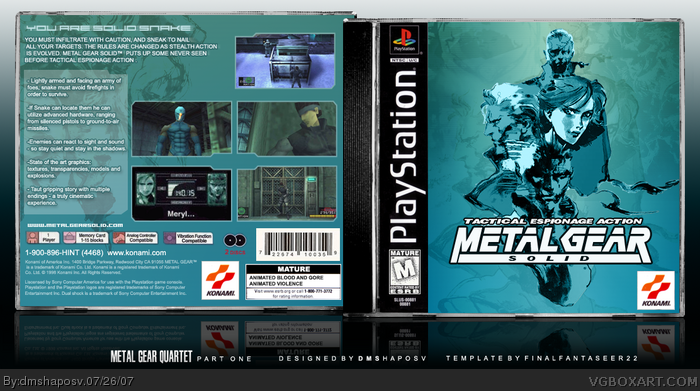
Okay, so I'm planning to make boxarts for all MGS game, 1-4.
This is part one. The others will only be made if this is well recieved. Otherwise I won't bother.
I worked quite hard on this.Yoji Shinkawa's art is a BITCH to cut out properly. Took ages.
So enjoy.
[ Reply ]
It's great, I just don't like the repeating imagery on the front.
[ Reply ]
@#2, I realised I accidently increased the opacity of the repeat image too much, while I was editting the back.
I've tone it down. Its alright now. :)
[ Reply ]
wow... just... wow...
[ Reply ]
wow!!! I looks foward to the others...
[ Reply ]
Nice, I love the colors and the front especially. But the screenshots and description feels squished into that side of the back. Would rather that it utilize the whole space, or at least more of it.
[ Reply ]
Great box 5/5.
[ Reply ]
@#6, I think you've got a point there. I felt the back was lacking too.
Anyway, update 3. I think all problems are now addressed.
[ Reply ]
Make another one please? :)
Edited at 1 decade ago
[ Reply ]
This box FAILS to be official MGS box. Fails miserably. Because it hasn't got Maryl's codec number. )
But...
From designers point of view it is actually really nice.
[ Reply ]
#10, "fails miserably"? don't you think that's... a BIT look harsh?
[ Reply ]
@#10, umm..ok..
[ Reply ]
lol, I"m gonna have to agree with feed on this one, the whole "check on the back of the box for the code" was genius...but design wise it's good
[ Reply ]
#10, I think Feed can just learn to bend over and kiss my @$$ on this one, because this is the best MGS box I've seen so far on this site. Amazing job. The only disappointing thing for me was realizing that the graphics in the Gamecube MGS games looked just like the graphics in this game. :( Also, I still love that template. Whoever made that template did a great job making it look nice and shiny ;).
[ Reply ]
Nice box. Great design.
[ Reply ]
This is
sick sick sick sick sick sick sick sick sick sick sick sick sick sick sick sick sick sick!
[ Reply ]
btw, if you add a stoke to the text it wil make the box look great. A 1 pixel wide, green(or black) would be just fine.
And add this screenshot link
That would make this box flawless.
[ Reply ]
I found I made some stupid spelling mistakes. "Sneark", sheesh.
Anyway, also threw in meryl for you MGS purists. Come to think of it, I was gonna put that screen but couldn't find a good quality one. Kudos to MGS union site for a high-res version.
[ Reply ]
beautiful.
[ Reply ]
I still think it's sick.
[ Reply ]
great... astonishing to be honest.
[ Reply ]
Congratulations on your entry in the Hall of Fame. I favorited this a while back and forgot to leave anything to say about it (Something that I find rather frustrating when it's my box.)
I'm a sucker for simple covers (By "simple" I mean covers with a primary color theme, and without twelve screens combined into a collage, with 120 photoshop filters applied, etc.) and cool color themes as well, so this cover appealed to me from the moment I saw it. I actually enjoy it much more than the official US cover (Delicious minimalism.)
I applaud you for being able to competently take the game's artwork and use it to it's full potential.
[ Reply ]
my... god... it's... it's... beautiful! (fals on floor and praises box) I'M NOT WORTHY! FAV+ 1000000000000(cubed)/5
[ Reply ]