damn, I started working on this like 4 months ago and stopped cause I couldn't get those dang lines on the ubisoft logo right. but cred to Mist for the lines, lodo for the temp, and Crayon Man for the template.
Awesome work. I love how you did the synopsis with the "swoop" thingy, it looks...sexy? I do love it though, it looks nice, clean, and smooth. And yet still gives you an idea of what the game is.
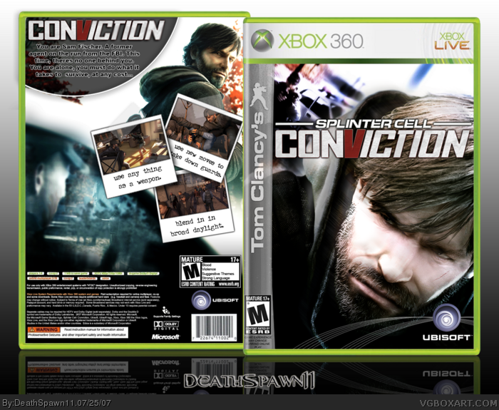
I like the polaroids you did for the screen. They are something around 111111119990000.672 times better and smoother than the ones on my Resi box.
Great work all around, 5/5 + Fav. Deserves a Hall of Fame spot.
 Tom Clancy's Splinter Cell: Conviction Box Cover Comments
damn, I started working on this like 4 months ago and stopped cause I couldn't get those dang lines on the ubisoft logo right. but cred to Mist for the lines, lodo for the temp, and Crayon Man for the template.
comments & critiques are welcome.
[ Reply ]
great box ;)
don't you mean "credit logo for the TC sidebar"?
[ Reply ]
Great job 4.5/5 .
[ Reply ]
#2-3, thx guys, and yea, I meant TC sidebar
[ Reply ]
Nice I like it. +FAV
Edited at 1 decade ago
[ Reply ]
+fav
this looks niceee.
[ Reply ]
#5-6, thx =)
[ Reply ]
Nice, I just don't like the font for the synopsis, and it's spelt as Fisher.
Edited at 1 decade ago
[ Reply ]
Awesome work. I love how you did the synopsis with the "swoop" thingy, it looks...sexy? I do love it though, it looks nice, clean, and smooth. And yet still gives you an idea of what the game is.
I like the polaroids you did for the screen. They are something around 111111119990000.672 times better and smoother than the ones on my Resi box.
Great work all around, 5/5 + Fav. Deserves a Hall of Fame spot.
[ Reply ]
This is a really awesome box! 5/5 +favs
[ Reply ]
#9, tbx lol, if you look closely on the pictures you can see tape on them ;)
[ Reply ]
Awesome, didn't notice. I phail :p
Love it. Now I would feel bad if I used tape on my future boxes...push pins here I come :p
[ Reply ]