er...i used the same artwork ages ago. (when it first came out) #2, the Z IS the background. This fact, plus the back temp is horrible, give it a 2.5/5
The front is a little above average. But i don't really like the back to much. It's creative but not very thought out, you should try cutting out zorro and placing him standing up in the back. Also try to think of a better way to place the font.
 The Destiny of Zorro Box Cover Comments
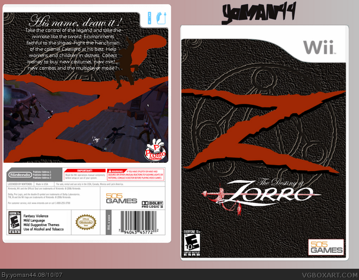
Here's my Zorro box XD That's a true game. I hope you like it guys.
[ Reply ]
omfg, the Z is a bit overused and doesn't fit the background :P
i mean, Zomfg x]
nice shot on the screenshots though.
4/5
[ Reply ]
I like the leather look, its pretty clean too. Good job.
[ Reply ]
er...i used the same artwork ages ago. (when it first came out) #2, the Z IS the background. This fact, plus the back temp is horrible, give it a 2.5/5
[ Reply ]
The front is a little above average. But i don't really like the back to much. It's creative but not very thought out, you should try cutting out zorro and placing him standing up in the back. Also try to think of a better way to place the font.
[ Reply ]
Better than your previous efforts.
[ Reply ]
4/5 5/5
[ Reply ]
#7, 4 or 5 ?
[ Reply ]
So, this is my last box for a week. I get bck here probably on Monday 20.
[ Reply ]