#3, which programme are you using?
if it's photoshop, put the character in Overlay mode on top of the logo, it will have almost the same effect as the characters in the sword in my Cabal box.
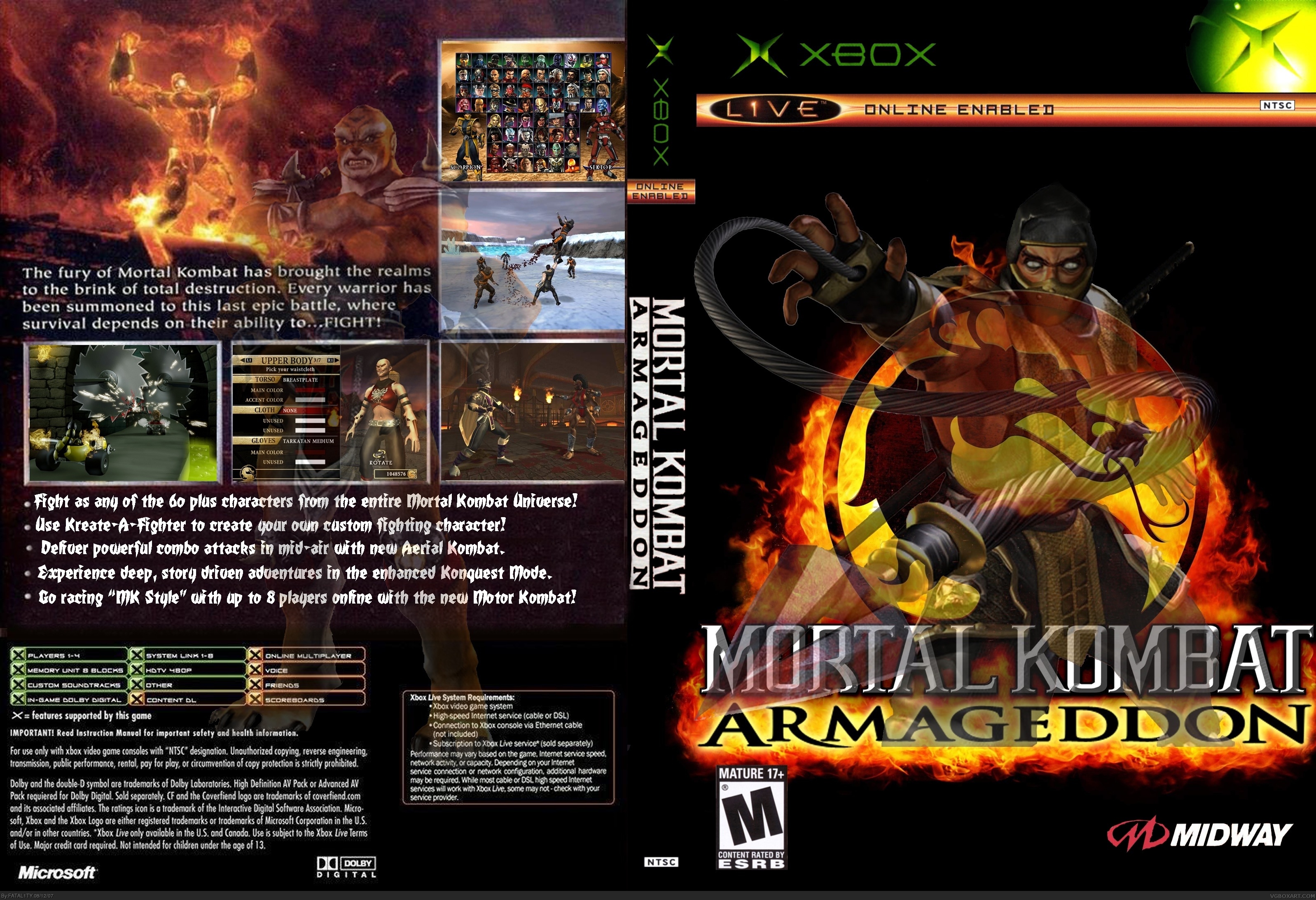
For version 2 I made Scorpion on the front more transparent and I darkened the back a bit. I also added the Midway Logo to the back and brightened the XBOX Logo.
For version 3 I decided to make it 3D! It was a really good job compared with the others. I just need to add the green color around the box. (the XBOX game case)I had to make the back smaller in order to make it 3D. Thanks a lot Ayron for telling me how to make it 3D.
I dont know if this is respectable crit or not but the picture from motor kombat with the spinning blades is from a stage that was removed in the final version (at least in the ps2 version, is it in the xbox one?)..
The other little things are just beefs.. no1, I don't like the bolded text on the back, its too bright or something.. and no2, put a better known character on the back.. if someone hadn't played the game to know that kintaro was redesigned (poorly I might add) they wouldn''t even know who he was..
the front looks great btw.. I look forward to seeing more
WEll, I don't want to seem mean, but Is that front pic just a wallpaper? Because it seems like it would be. Also, you'll want to make sure the logo doesnt spill off onto the spine.
In full view the pictures look too low quality.
But in minimized view it looks good.
Don't be afraid to use the Critiques section of the forums.
 Mortal Kombat: Armageddon Box Cover Comments
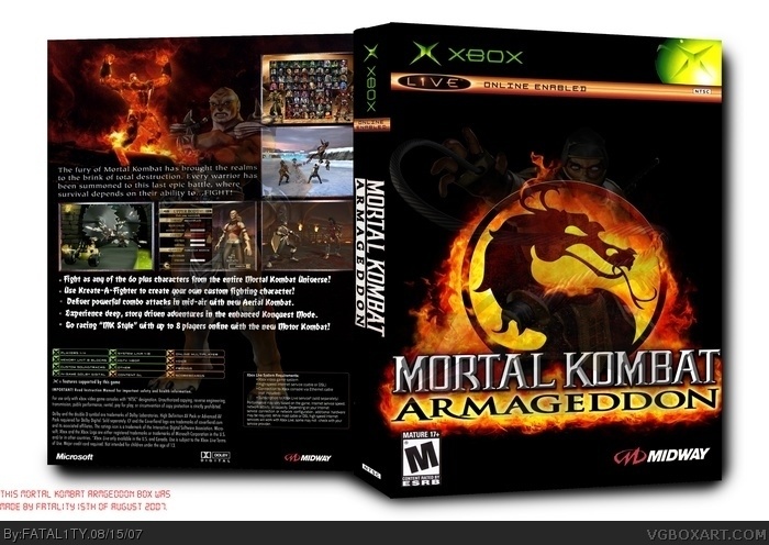
My very first box. I'm only 13 so go easy on me. Took me about 2 days seeing as I'm new.
[ Reply ]
it's pretty reasonable, but the low-opacity character on the front isn't too nice
nice first, and welcome ;)
[ Reply ]
I thought just have the logo on the front would look boring so I added a character to go with it. And thanks for the welcoming
[ Reply ]
#3, which programme are you using?
if it's photoshop, put the character in Overlay mode on top of the logo, it will have almost the same effect as the characters in the sword in my Cabal box.
[ Reply ]
Thanks #4. Your Cabal Online box is really good. Do you also think I should darken the back of the box a bit and find a better XBOX logo?
[ Reply ]
#5, you might want to darken it a bit, but i don't see anything wrong with the logo.
[ Reply ]
Once again, I'm liking how there's a surge on great first boxes right now, yours being one of them. great job and keep it up.
[ Reply ]
Thanks a lot #7 and #6. I love it how we just help eachother. I've also fixed it up. How do I add another version?
Edited at 1 decade ago
[ Reply ]
For version 2 I made Scorpion on the front more transparent and I darkened the back a bit. I also added the Midway Logo to the back and brightened the XBOX Logo.
[ Reply ]
For version 3 I decided to make it 3D! It was a really good job compared with the others. I just need to add the green color around the box. (the XBOX game case)I had to make the back smaller in order to make it 3D. Thanks a lot Ayron for telling me how to make it 3D.
[ Reply ]
I dont know if this is respectable crit or not but the picture from motor kombat with the spinning blades is from a stage that was removed in the final version (at least in the ps2 version, is it in the xbox one?)..
The other little things are just beefs.. no1, I don't like the bolded text on the back, its too bright or something.. and no2, put a better known character on the back.. if someone hadn't played the game to know that kintaro was redesigned (poorly I might add) they wouldn''t even know who he was..
the front looks great btw.. I look forward to seeing more
[ Reply ]
WEll, I don't want to seem mean, but Is that front pic just a wallpaper? Because it seems like it would be. Also, you'll want to make sure the logo doesnt spill off onto the spine.
In full view the pictures look too low quality.
But in minimized view it looks good.
Don't be afraid to use the Critiques section of the forums.
[ Reply ]
Nice Cover
[ Reply ]