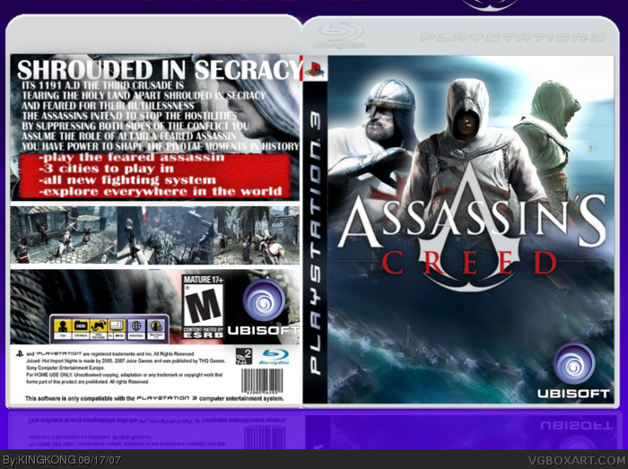
THe ront looks really nice but is destroyed by the back. The text is blurry. The logos on the back are too big. The M rating goes on the front and on the back it says details of why that rating. Nice try tough.
Sorry for the late post, but ummm... well... yeah...
Bad font choice.
Altair shouldn't be on the cover twice.
Screenshots don't look good.
It's a PEGI temp with an Ehe back.
No ESRB on the front.
Bad picture choice on the back.
Again, sorry for the late post. I just couldn't help but say something. 3/5
 Assassin's Creed Box Cover Comments
hey im back i will be making boxes regurlerly(i know i didnt spell that right)
[ Reply ]
can someone like comment plz!!!!
[ Reply ]
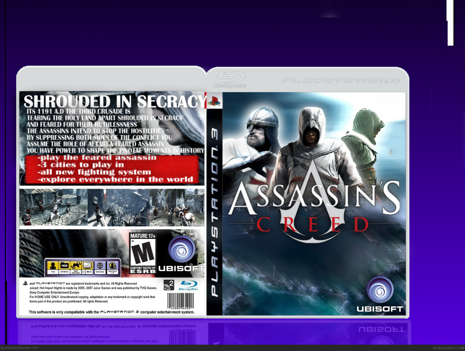
THe ront looks really nice but is destroyed by the back. The text is blurry. The logos on the back are too big. The M rating goes on the front and on the back it says details of why that rating. Nice try tough.
[ Reply ]
Not too bad. I actually really love the front. It's different than what we've been getting here lately.
But you need to resize the font size of the back.
[ Reply ]
that looks awesome...
5/5 cause it looks cool, i dont know what it is, but its awesome
fav
[ Reply ]
#5, thx
[ Reply ]
Sorry for the late post, but ummm... well... yeah...
Bad font choice.
Altair shouldn't be on the cover twice.
Screenshots don't look good.
It's a PEGI temp with an Ehe back.
No ESRB on the front.
Bad picture choice on the back.
Again, sorry for the late post. I just couldn't help but say something. 3/5
[ Reply ]