The 2 in the title looks like it was done really quick using Paint, and the logo on the back is just a DeadRising 1 logo. The Background is OK but I would have malby done a real life pic of the city and edit it with Photoshop to look creepier. Overall 2/5
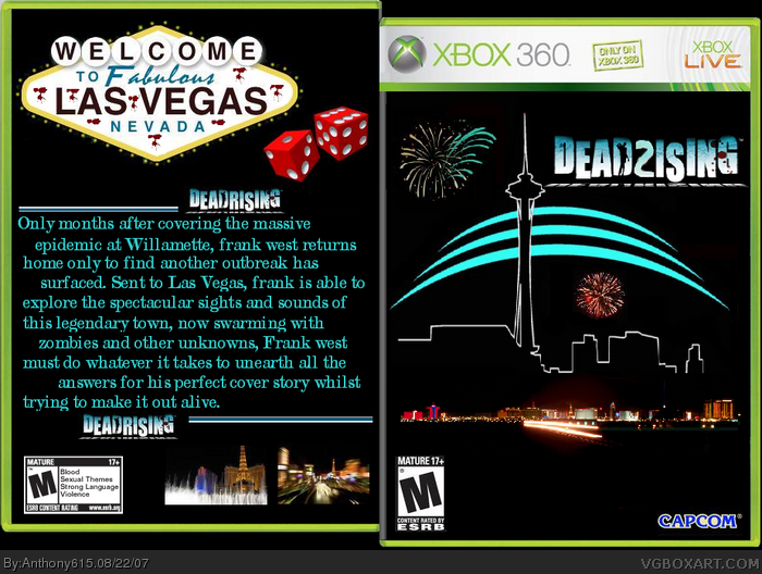
 Dead Rising 2 Box Cover Comments
the logo could use alot of work and so could the back. maybe change the font from chiller to something from dafont.com. 1/5
Edited at 1 decade ago
[ Reply ]
looks ok just to much black, and its not in a good way. work on it some more.
[ Reply ]
too much black....wtf...what do you want me to do? its a dark game not bright and happy mood. what should i do?
Edited at 1 decade ago
[ Reply ]
There quite a few problems - nothing related to zombies, bad editing on the back, bland font... just not too good. 1/5
[ Reply ]
You could've used the Deadrising 2 logo I created (see my DR2 (PC) box).
[ Reply ]
The 2 in the title looks like it was done really quick using Paint, and the logo on the back is just a DeadRising 1 logo. The Background is OK but I would have malby done a real life pic of the city and edit it with Photoshop to look creepier. Overall 2/5
[ Reply ]
talk about a late post...but thanks anyways
[ Reply ]