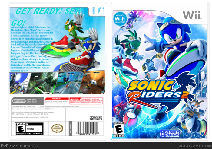
the front is very good but the back looks more like sonic riders 1 box
the desciption,the art,and the pics,
PS.where did you get the pics on the front???
this is cool, your best so far methinks. try putting the back title just in one line if you can and back could also be less blurry, still great. keep it up :)
its ok here are my complaints though
1. Use The official logo it can be found after a bit of effort
2. Edit the Wii controllers info so that its 4 players (also this games going to be wi-fi so add that)
3. add some screen borders
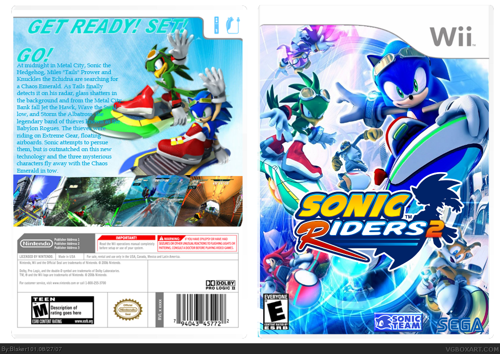
the back is good but the front is just like zero gravity's one! you just removed "zero gravity" and used the original sonic riders logo put a "2" at the end!
 Sonic Riders 2 Box Cover Comments
My first Wii box hope you like it!
Edited at 1 decade ago
[ Reply ]
My eyes can'na take it
AMAZING/5
faved
Edited at 1 decade ago
[ Reply ]
Now i look closer you should edit the rating description but still the front looks
AMAZING/5
[ Reply ]
Thanks for the comments. :)
[ Reply ]
the front is very good but the back looks more like sonic riders 1 box
the desciption,the art,and the pics,
PS.where did you get the pics on the front???
Edited at 1 decade ago
[ Reply ]
...sorry 4 the duble post
Edited at 1 decade ago
[ Reply ]
hey, this is pretty good! back could be less empty, but still nice. great job
[ Reply ]
this is cool, your best so far methinks. try putting the back title just in one line if you can and back could also be less blurry, still great. keep it up :)
[ Reply ]
its ok here are my complaints though
1. Use The official logo it can be found after a bit of effort
2. Edit the Wii controllers info so that its 4 players (also this games going to be wi-fi so add that)
3. add some screen borders
other then that nice box
[ Reply ]
The front is just the most recent picture released of the game. And the back is kinda blur. And the blue text is too simplistic.
[ Reply ]
Updated
[ Reply ]
this is my best one so far.
[ Reply ]
#12, I agree
[ Reply ]
thanks for the comment and fav! :)
Edited at 1 decade ago
[ Reply ]
This box almost looks like the one in the hall of fame
[ Reply ]
the back is good but the front is just like zero gravity's one! you just removed "zero gravity" and used the original sonic riders logo put a "2" at the end!
sorry, didnt see this one was old!
Edited at 1 decade ago
[ Reply ]