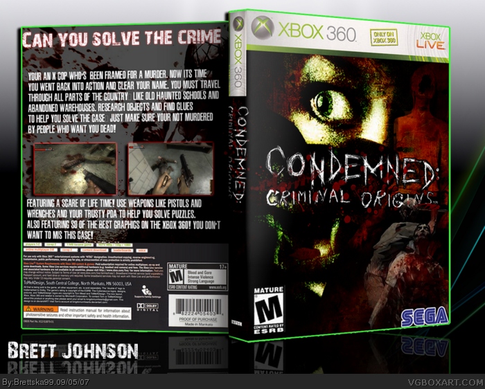
My contest box for the survival horror contest round 2, i know i'm going to lose because LadyKiller is a fantastic boxartist and i bet my box is no match for his, i could find art for this so i used the little i had, enjoy!
Time to point out spelling errors!!! First of all, don't you mean you COULD'NT find art for this? (sry, I can't make it itallic, so I just use caps.) On the actual box, it says SO instead of SOME of the best graphics on the XBOX 360. Also, it says you don't wanna MIS this case. I'm pretty sure you can figure that one out.
#2, meh who cares. sure they matter, but at the same time they don't really affect the overall design unless the errors are all over the place which is untrue for this box. brettska this is a great box especially the front. btw, can you tell me where to get the font of the logo or is that just the logo itself? I need a good scary font....badly. tnx :)
I know its all about the art, but correct spellings and good grammar really make a box look and feel more official. For e.g, Mad spike's first lang is not english, but you won't find a lot of spelling/grammar mistakes on his boxes.
 Condemned: Criminal Origins Box Cover Comments
My contest box for the survival horror contest round 2, i know i'm going to lose because LadyKiller is a fantastic boxartist and i bet my box is no match for his, i could find art for this so i used the little i had, enjoy!
[ Reply ]
Time to point out spelling errors!!! First of all, don't you mean you COULD'NT find art for this? (sry, I can't make it itallic, so I just use caps.) On the actual box, it says SO instead of SOME of the best graphics on the XBOX 360. Also, it says you don't wanna MIS this case. I'm pretty sure you can figure that one out.
[ Reply ]
#2, meh who cares. sure they matter, but at the same time they don't really affect the overall design unless the errors are all over the place which is untrue for this box. brettska this is a great box especially the front. btw, can you tell me where to get the font of the logo or is that just the logo itself? I need a good scary font....badly. tnx :)
[ Reply ]
#3, Actually, there are a lot of errors. In addition to what Star89er covered.
It's "You're", not "Your" in both those cases in the first paragraph.
And "a scare of life time" doesn't make any sense.
[ Reply ]
It's just spelling errors, for God's sake.
Box art is ART, not some vocab lesson.
[ Reply ]
#3, sorry its just the logo itself, and yes i am a terrible speller
[ Reply ]
I know its all about the art, but correct spellings and good grammar really make a box look and feel more official. For e.g, Mad spike's first lang is not english, but you won't find a lot of spelling/grammar mistakes on his boxes.
Edited at 1 decade ago
[ Reply ]
#7, Thats just because he copys wiki descriptions like many artists do
[ Reply ]
#8, what? i didn't copy wiki's description, if i did the splling would been so bad
[ Reply ]