[ Buy Cruis'n at Amazon ] By Ranmakuu 15 on September 8th, 2007 No Printable Available Cruis'n Box Cover Comments Comment on Ranmakuu's Cruis'n Box Art / Cover. Cancel Reply Ranmakuu 15 [ 1 decade ago ] So I reposted this also I made a few changes now it has a bit better back with a better background. So now what do you think? [ Reply ] hunter1993 2 [ 1 decade ago ] that is one brilliant box [ Reply ] ELCrazy 50 [ 1 decade ago ] Unfortunately, it isn't. First of all, the back summary text is just crying out for a 1px Stroke. The front is okay, but the logo is horrid. But why the hell am I even telling you this? You're never gonna improve. [ Reply ] Vengeance 40 [ 1 decade ago ] the logo looks awfully familiar... i've seen that font before [ Reply ] Remy669 1 [ 1 decade ago ] Stop... using... that.. font! Man, after max. half a year, and i thought you'd finnaly learned =P Although i don't think you all remember me... [ Reply ] verity666912 1 [ 1 decade ago ] The front is good but the back is rubbish, it looks very amateury. Edited at 1 decade ago [ Reply ]
 Cruis'n Box Cover Comments
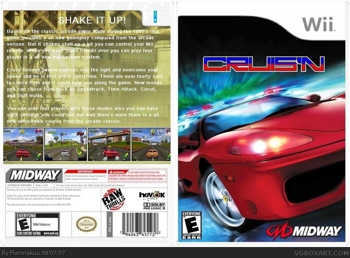
So I reposted this also I made a few changes now it has a bit better back with a better background. So now what do you think?
[ Reply ]
that is one brilliant box
[ Reply ]
Unfortunately, it isn't. First of all, the back summary text is just crying out for a 1px Stroke.
The front is okay, but the logo is horrid.
But why the hell am I even telling you this? You're never gonna improve.
[ Reply ]
the logo looks awfully familiar... i've seen that font before
[ Reply ]
Stop... using... that.. font!
Man, after max. half a year, and i thought you'd finnaly learned =P
Although i don't think you all remember me...
[ Reply ]
The front is good but the back is rubbish, it looks very amateury.
Edited at 1 decade ago
[ Reply ]