[ Buy Star Wars: T... at Amazon ] By ELCrazy 50 on September 8th, 2007 No Printable Available [ Box updated on October 4th, 2007 ] [ original ] Star Wars: The Force Unleashed Box Cover Comments Comment on ELCrazy's Star Wars: The Force Unleashed Box Art / Cover. Cancel Reply ELCrazy 50 [ 1 decade ago ] So here's my 2nd box, as I said. This took longer than my second, most probably 3 hours. I really like how the front turned out. Favs and comments are greatly appreciated! :) [ Reply ] Brettska99 45 [ 1 decade ago ] Front= 5/5 amazing Back = 4.5 great the text is to small [ Reply ] TwilightMystics 42 [ 1 decade ago ] I agree with Brettska99 [ Reply ] Ervo 48 [ 1 decade ago ] Great job mate. [ Reply ] finalfantaseer22 43 [ 1 decade ago ] this is nice, but the m ratingbox is touching the bottom and the lucas arts logo is too big. other than that its great [ Reply ] werdney 5 [ 1 decade ago ] This is really cool too. Great job on two boxes. [ Reply ] frenchboy1 34 [ 1 decade ago ] The front kcick-ass but the back should add better frames. [ Reply ] Vengeance 40 [ 1 decade ago ] dang, this is nice. -M rating is too close to edge (shouldn't it be T? correct me) -get the new lucasarts logo (i'll send it you on msn) 4.5/5 [ Reply ] Roboross 31 [ 1 decade ago ] It reminds me a lot of Trevownz's box. [ Reply ] Destroyer 21 [ 1 decade ago ] Awesome. The front kick my ass so hard. [ Reply ] ELCrazy 50 [ 1 decade ago ] #9, There's actually a whole lot of differences. link VERSION 2: ADDED MINOR ADJUSTMENTS. Edited at 1 decade ago [ Reply ] Roboross 31 [ 1 decade ago ] #11, Um dude, i didn't say they were the same. I said that it "reminded me" [ Reply ] ELCrazy 50 [ 1 decade ago ] #12, Oh k sorry for the miscommunication. [ Reply ] TrevOwnz 42 [ 1 decade ago ] Wow so you deffenitly took the idea i was doing for my box update. I don't care I'm still using Vader and that bottom image. [ Reply ] ELCrazy 50 [ 1 decade ago ] Updated with better quality 2D. VIEW IN FULL! [ Reply ] xIAMHUNTERx 43 [ 1 decade ago ] The side is bland and the "t" in "the" is barely visible. But still, great job. [ Reply ] gandalf0987 1 [ 1 decade ago ] man you should be a box art designer. [ Reply ] ELCrazy 50 [ 1 decade ago ] #17, HAHA thanks [ Reply ]
 Star Wars: The Force Unleashed Box Cover Comments
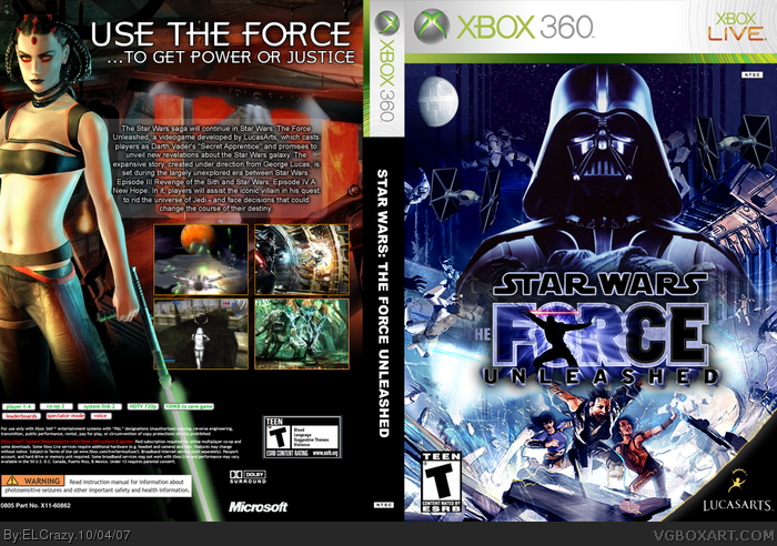
So here's my 2nd box, as I said. This took longer than my second, most probably 3 hours.
I really like how the front turned out.
Favs and comments are greatly appreciated! :)
[ Reply ]
Front= 5/5 amazing
Back = 4.5 great
the text is to small
[ Reply ]
I agree with Brettska99
[ Reply ]
Great job mate.
[ Reply ]
this is nice, but the m ratingbox is touching the bottom and the lucas arts logo is too big. other than that its great
[ Reply ]
This is really cool too. Great job on two boxes.
[ Reply ]
The front kcick-ass but the back should add better frames.
[ Reply ]
dang, this is nice.
-M rating is too close to edge (shouldn't it be T? correct me)
-get the new lucasarts logo (i'll send it you on msn)
4.5/5
[ Reply ]
It reminds me a lot of Trevownz's box.
[ Reply ]
Awesome. The front kick my ass so hard.
[ Reply ]
#9, There's actually a whole lot of differences.
link
VERSION 2: ADDED MINOR ADJUSTMENTS.
Edited at 1 decade ago
[ Reply ]
#11, Um dude, i didn't say they were the same. I said that it "reminded me"
[ Reply ]
#12, Oh k sorry for the miscommunication.
[ Reply ]
Wow so you deffenitly took the idea i was doing for my box update. I don't care I'm still using Vader and that bottom image.
[ Reply ]
Updated with better quality 2D.
VIEW IN FULL!
[ Reply ]
The side is bland and the "t" in "the" is barely visible.
But still, great job.
[ Reply ]
man you should be a box art designer.
[ Reply ]
#17, HAHA thanks
[ Reply ]