dude...you gotta stop, you're making me feel bad XD anyway, good box. I suggest the green text below the back title should be bigger though. still awesome, did I say I'm your new fan now? yes...yes I am.
I think it's a good effort, but the text on the back seems to be all over the place. It'd be nice if you try to organize the back more. A caption that had a more simple font could be better too.
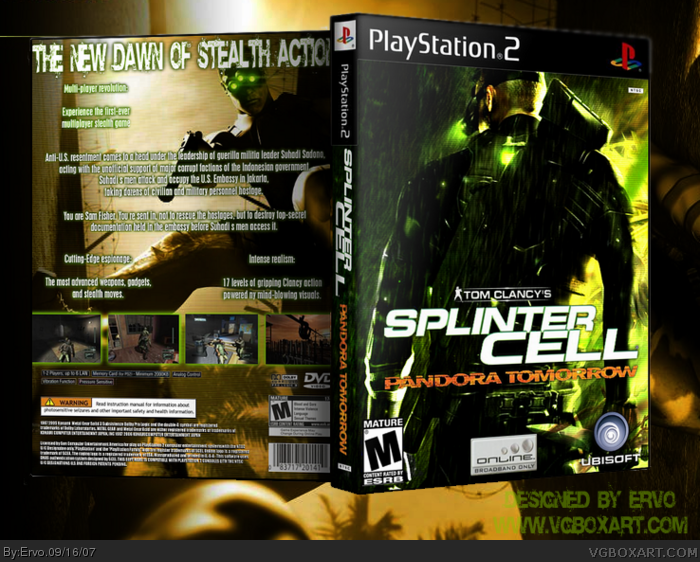
 Splinter Cell: Pandora Tomorrow Box Cover Comments
not your best, box great nonetheless, 4.5/5
[ Reply ]
Hope y'all like it.
[ Reply ]
Hope y'all like it.
[ Reply ]
Hope y'all like it.
E: It wasn't me who pressed reply three times a row :D
Edited at 1 decade ago
[ Reply ]
dude...you gotta stop, you're making me feel bad XD anyway, good box. I suggest the green text below the back title should be bigger though. still awesome, did I say I'm your new fan now? yes...yes I am.
[ Reply ]
#5, that's great! Second best boxartist on tha site is my fan, i feel special :D
[ Reply ]
I think it's a good effort, but the text on the back seems to be all over the place. It'd be nice if you try to organize the back more. A caption that had a more simple font could be better too.
[ Reply ]
i agree with #7, but really good job otherwise. 4/5 mang
[ Reply ]
#7, i'll try to do that later today if i remember :D I'll porpably start a Chaos Theory box so i'm not sure will i remember :P
[ Reply ]
I love the front. Back... Eh.
[ Reply ]
isn't the front just a cropped wallpaper
[ Reply ]
Im not really feelin this one. The text is everywhere on the back.
[ Reply ]
#12, I made it like two years ago, dude.
[ Reply ]
#13, And I still feel the same way.
[ Reply ]