The front is really cool, and the back is good except: The text should be a different font. Search on sites like typenow.net, 1001fonts.com, and dafont.com.
Your customary "poster edges" technique doesn't really work here. Go for a sleek cover. And there is so much going on at the bootom of the front cover, but nothing on the top (a lot of empty space). Plus, the back is bland as can be. I wouldn't use those large red or blue masks on the top section of the front or the back.
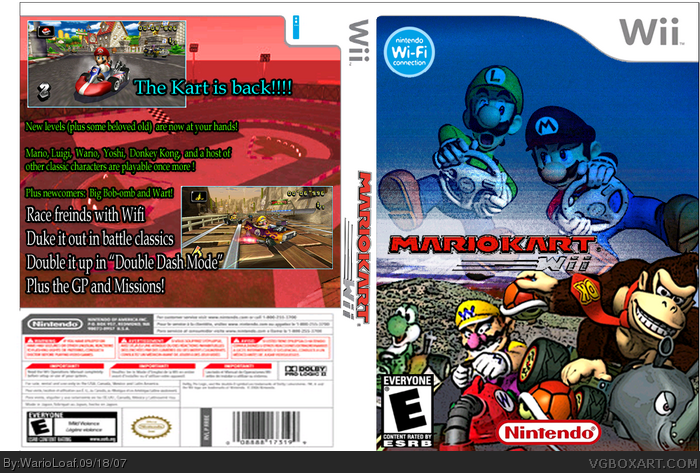
 Mario Kart Wii Box Cover Comments
The front is really cool, and the back is good except: The text should be a different font. Search on sites like typenow.net, 1001fonts.com, and dafont.com.
[ Reply ]
I like this :) Very nice. 4/5
[ Reply ]
wow... this is actually really cool! i love the front especially. the back is only ok, though.
4/5
[ Reply ]
Your customary "poster edges" technique doesn't really work here. Go for a sleek cover. And there is so much going on at the bootom of the front cover, but nothing on the top (a lot of empty space). Plus, the back is bland as can be. I wouldn't use those large red or blue masks on the top section of the front or the back.
[ Reply ]