ok.. try gimp and as my foreman siad, it's not that bad for a fist box ;)
So, for the box itself:
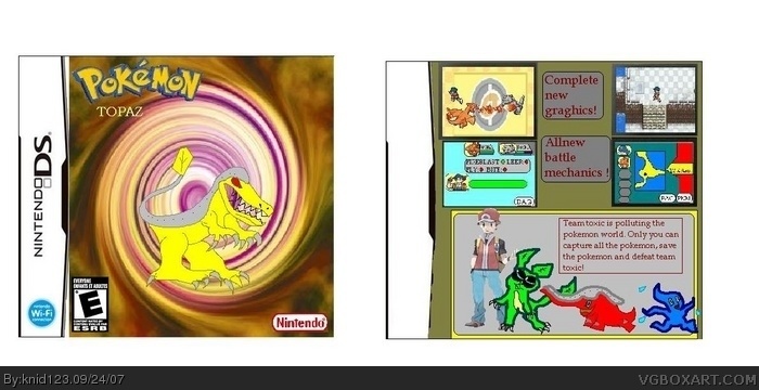
there are some spelling mistakes, f.e. graghics instead of graphics. and also try to use some other fonts like arial and/or times new roman. Try searching for some new fonts on www.dafont.com
Also the Nintndo Logo on the front is too stretched, doesn't look real ;)
Hmm...
What I noticed was that when you used the white eliminater tool, you made the inside of the pokemon's teeth go away. Try fixing the template and try a new layout.
#5, i think ssbb guy changed his anyway the front is alrite but the back is effortless
my advice is to try again but put more effort in
it deserves 2/5
 pokemon topaz Box Cover Comments
hey guys! this is my first box so be nice.
i reckon its good but what do u think about it? im working on a second box, but i need to know what you think of this one. enjoy^^
Edited at 1 decade ago
[ Reply ]
Anyway, for a first, it's not too bad, but you should download Gimp. It's sorta like a free version of Photoshop.
Now, it's 2/5
Edited at 1 decade ago
[ Reply ]
ok.. try gimp and as my foreman siad, it's not that bad for a fist box ;)
So, for the box itself:
there are some spelling mistakes, f.e. graghics instead of graphics. and also try to use some other fonts like arial and/or times new roman. Try searching for some new fonts on www.dafont.com
Also the Nintndo Logo on the front is too stretched, doesn't look real ;)
[ Reply ]
Hmm...
What I noticed was that when you used the white eliminater tool, you made the inside of the pokemon's teeth go away. Try fixing the template and try a new layout.
[ Reply ]
anyone notice his avatar is the same as that kids that was spamming the official SSBB.
[ Reply ]
#5, i think ssbb guy changed his anyway the front is alrite but the back is effortless
my advice is to try again but put more effort in
it deserves 2/5
[ Reply ]
Oh my god. This is not very good. You have a typo (graghics) and the picture is...um. Well, carry on I guess.
[ Reply ]
um for a 1st... its ok but its not very good
[ Reply ]