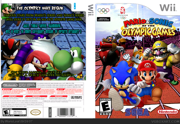
Characters on front seem to have different quality in detail. Eggman looks more detailed then sonic. Improve on inconsistencies like that and this could turn out to be a pretty good box. Dont stretch the characters from there original sizes. When you strech, try holding the shift key to stop it from changing the ratios of height to width.
2/5
 Mario & Sonic: At The Olympic Games Box Cover Comments
Thats pretty kewl but the background is pretty messed up and the back isnt that good at tall
[ Reply ]
Ugh... The back... It stinks! 3/5 'cause its okay.
[ Reply ]
cool 4/5
[ Reply ]
Sorry, and not to be harsh, but this is bad! 2/5!
[ Reply ]
Characters on front seem to have different quality in detail. Eggman looks more detailed then sonic. Improve on inconsistencies like that and this could turn out to be a pretty good box. Dont stretch the characters from there original sizes. When you strech, try holding the shift key to stop it from changing the ratios of height to width.
2/5
[ Reply ]