I agree, the front is great, but the back...isn't XD
I like how you tried to make the description and screenies go with the angle of the sword, but it just isn't going to work. Try making it horizontal as it normally would be, but maybe keep everything above the sword, if you know what I mean =S
#5, Hey thanks ;)
#3, I took description from some site I found. Because I write some flaws when I do this myself :) Thanks anyway.
#2, Thanks for faving ^^
#4, I know what you mean, I tried to do it like that but it wasn't very original... I was looking for how can I make a back with this pic. So I thougt it was better to put it with the angle of the big sword.
But, you might consider thinking that comment over once more.
this box is just.. so beautifull o.o'
it makes me even more scared about the upcoming competition round.
why does the back template say Sega Europe? it looks kinda like it was edited from this... link not saying that you did or anything, but it kinda looked familiar, also that big empty white space kinda gives it away aswell, you could tell that's where my dev logos and stuff went, maybe you should fill it with dev logos and havok logo etc.
 The Last Remnant Box Cover Comments
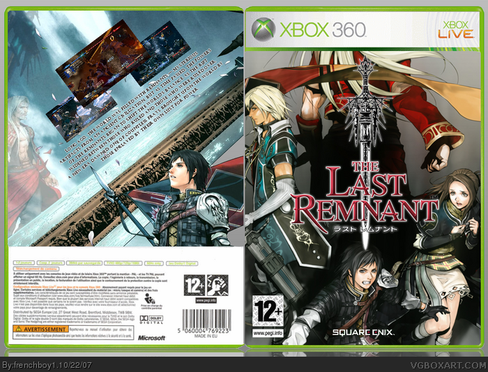
Well, here's my latest box :D ! Please leave comments !!! And if this isn't that good, tell me what's wrong : I can change almost everything...
[ Reply ]
front is amazing, back not as good, but still nice.
[ Reply ]
It's nice but on the back I wish the description wasn't slanted and a caption wouldn't hurt.
[ Reply ]
I agree, the front is great, but the back...isn't XD
I like how you tried to make the description and screenies go with the angle of the sword, but it just isn't going to work. Try making it horizontal as it normally would be, but maybe keep everything above the sword, if you know what I mean =S
[ Reply ]
Hey, that's pretty cool!
[ Reply ]
#5, Hey thanks ;)
#3, I took description from some site I found. Because I write some flaws when I do this myself :) Thanks anyway.
#2, Thanks for faving ^^
#4, I know what you mean, I tried to do it like that but it wasn't very original... I was looking for how can I make a back with this pic. So I thougt it was better to put it with the angle of the big sword.
[ Reply ]
#4 i agree, i really like the idea outting them on an angle alone side the side but it does make the images and writing hard to see/read.
[ Reply ]
Oh em ef gee!?
When did you get better than me :O?
Faved.[D0H]
[ Reply ]
#8, lol Thanks but you're WAY better than me ^^
[ Reply ]
#9, You're welcome.
But, you might consider thinking that comment over once more.
this box is just.. so beautifull o.o'
it makes me even more scared about the upcoming competition round.
Edited at 1 decade ago
[ Reply ]
why does the back template say Sega Europe? it looks kinda like it was edited from this... link not saying that you did or anything, but it kinda looked familiar, also that big empty white space kinda gives it away aswell, you could tell that's where my dev logos and stuff went, maybe you should fill it with dev logos and havok logo etc.
[ Reply ]
#11, where does it say "Sega Europe" ?
[ Reply ]
#12, about 3/4 of the way down, slightly above the "Avertissement" box. It says "distributed by Sega Europe..."
[ Reply ]