I don't mean to be mean, but I'll fav it when theres less text on the back. You practically wrote a book. The point of the game summary is to be quick and concise and to draw the reader and potential buyer in. Otherwise, the box is great.
make the text bigger so it fills up more of the back and give it a cool font. It's still too long... look at the official back, most summaries are usually like 2 or 3 lines long.
 Okami Box Cover Comments
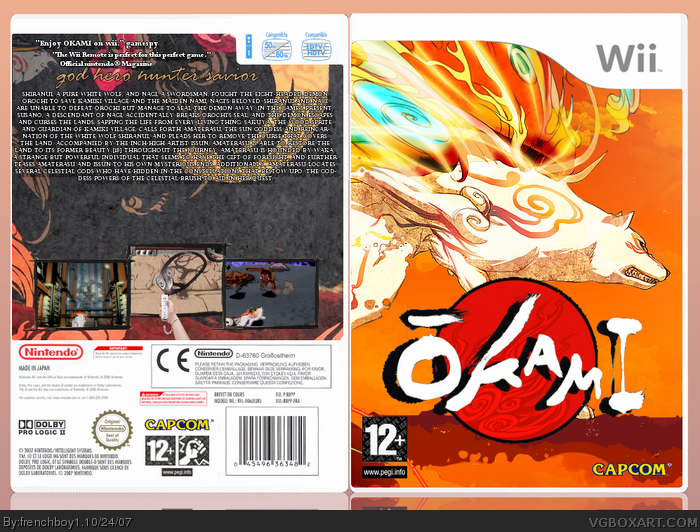
Finally done :) Please check out the full view and leave comments :D
I'm pretty proud of this one ^^
[ Reply ]
3 favs !!? Thanks ^^
[ Reply ]
I think you did a great job, but I just don't like how there is a lot of text at the back.
[ Reply ]
#3, there is a lot of things to say about this beatiful game :D Thanks
[ Reply ]
covers looks good, i like the design around the screenshots but there does seem like a lot of text.
[ Reply ]
There's even more text than in my boxes :o It looks great anyway. Faved.
[ Reply ]
#6, Thanks :D
[ Reply ]
cool, but i don't like what you did to the logo, and there's WWAAYYY to much text, and the font doesn't suit the game, for that matter.
[ Reply ]
and people thought I had too much text? :O
[ Reply ]
I don't mean to be mean, but I'll fav it when theres less text on the back. You practically wrote a book. The point of the game summary is to be quick and concise and to draw the reader and potential buyer in. Otherwise, the box is great.
[ Reply ]
Youre text is a weird font and not very legible either.
[ Reply ]
I agree with the criticisms so far, not bad though
[ Reply ]
I'll update it whith less text.
Edit : Done, I remove the bottom text. Please leave comments !
Edited at 1 decade ago
[ Reply ]
I think there's still too much text. :(
[ Reply ]
make the text bigger so it fills up more of the back and give it a cool font. It's still too long... look at the official back, most summaries are usually like 2 or 3 lines long.
[ Reply ]
The text on the back was copied and pasted from The Okami Page of Wikipedia... But other than that , It's Alright.
[ Reply ]