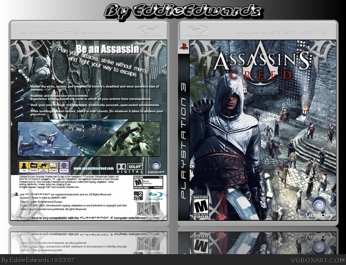
(view zooming in full looks better)
first is my first try doing a back cover, what do you think of it?
does the tribal art in the corners of the box look good, or should i remove them?
any other chnaged?
Problems :
-Big text (the blue one) shouldn't have this font and this colour, it doesn't fit at all.
-I don't like the reapeatiting image of Altair on front.
 Assassin's Creed Box Cover Comments
(view zooming in full looks better)
first is my first try doing a back cover, what do you think of it?
does the tribal art in the corners of the box look good, or should i remove them?
any other chnaged?
[ Reply ]
Awesome :
-screens
-little text
Problems :
-Big text (the blue one) shouldn't have this font and this colour, it doesn't fit at all.
-I don't like the reapeatiting image of Altair on front.
[ Reply ]
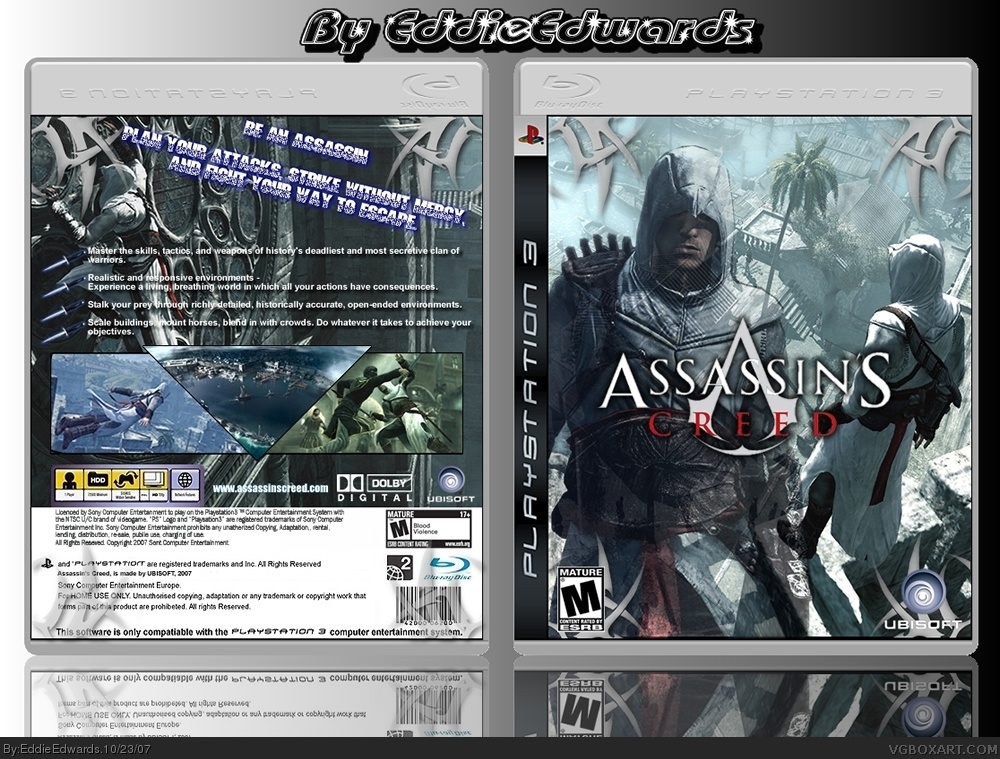
what colour should i change the blue text too (as i want it to stand out more over the text below? Should i also put it straight or leave on tilt?
if i remove the left altair on front cover then the image will just be a screenshot.
[ Reply ]
Version2: i've changed the background on front cover and made altair more solid, moved the title and also edited the text on the back.
Plz more comments and ratings.
[ Reply ]
Now this is nicer ! faved
[ Reply ]
#5 thanks man, it means a lot coming from someone that does great box art. hopefully i can make some more good ones or update my older ones.
[ Reply ]
This is great,
it'll be better if you line up the screens though.
[ the upper screenshot rises above the others a wee tiny bit ;) ]
Faved anyways.
[ Reply ]
#7 thanks for comment and fav, but thats how i wanted the screens to be.
[ Reply ]
#8, ok dude, it's your design ;), i just think it'd look better that way =]
[ Reply ]
Pretty good.
[ Reply ]