I don't like the screenshots... They just dont look good. If you just slightly tilted them instead of turning them completely then it would look good. 4/5
island of happiness is going to be a DS game. and the art you are using is from a wonderful life. it doesnt really make sence. but i like the look of the box.
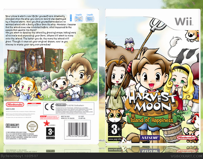
 Harvest Moon: Island of Happiness Box Cover Comments
You'll probably ask "WTF with the screens ?" , don't ask, I do this to make it funner ^^
[ Reply ]
#1, WTF is with the screens?
no seriously, it doesn't suit the game.
[ Reply ]
Nicely done. That little kid on the back...his hat has always bugged me, looks like an a$$ on his head.
[ Reply ]
I was actually gonna flame you as I thought you were Ranmakuu :p
Anyway, great job! :) Overall flawless.
[ Reply ]
I don't like the screenshots... They just dont look good. If you just slightly tilted them instead of turning them completely then it would look good. 4/5
[ Reply ]
I thought it was Ranmakuu's box but when i saw that the logo look's good i knew it wasn't :D Change the screenshots and it'll look good :)
[ Reply ]
WTF with the screems, lmao (seriosly why are they sideway)
[ Reply ]
#7, I know, I hate the way that looks
[ Reply ]
The back is a little boring and blurry. It needs more i think.
[ Reply ]
island of happiness is going to be a DS game. and the art you are using is from a wonderful life. it doesnt really make sence. but i like the look of the box.
[ Reply ]