ok, i have some few suggestions for you. ;)
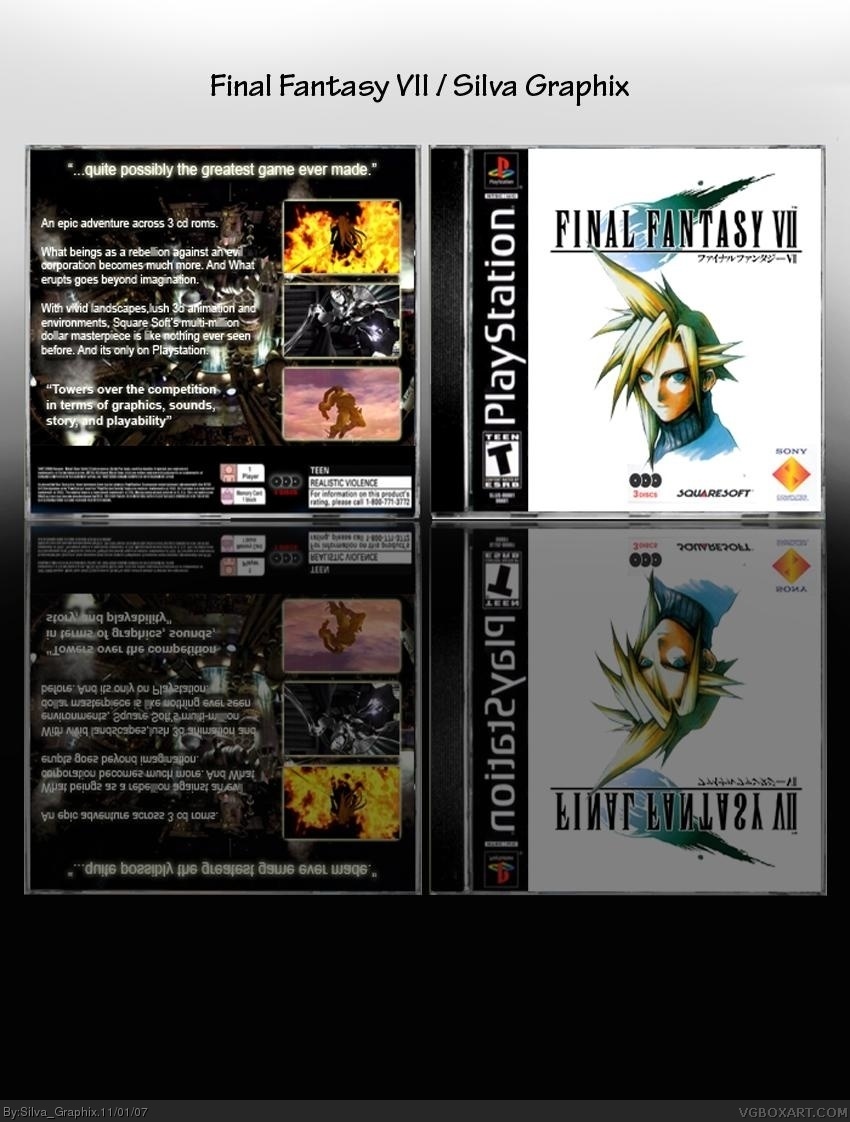
1- Cloud on the front looks like fan-art. fan art is a big no, unless it looks really similar to the original.
2-Cloud is touching the FF7 logo, distracting the attention from both the logo and cloud, making the box look a bit fuller than it is.
3-the reflection is really big, try going into gradient mask, than just make a line with the gradient tool, switch back to normal mode, and delete..
4-lower the opacity of the reflection. it's too visible.
5-stick to a color scheme, you've picked white on the front, and black for the back,whereas both white or both black would look better.
Wow Silva Graphix! This is great! The back is fine, but I'm not so sure about the front. It's a bit too plain for my tastes. Maybe if you added a background, it would look less bland. Good box, especially for a first. Welcome to the site. 4/5
#16, hey thanks i know that front is a bit plain, i tried to keep it simple like most of the ff boxes. and i like this site, lots of good boxes i have seen.
Here are some helpfull links:
official cover site, good for summaries etc. www.cdcovers.cc
A great render site, you might've seen it. www.planetrenders.net
A nice wallpaper site, be sure to edit though. www.gamewallpapers.ru
 Final Fantasy VII Box Cover Comments
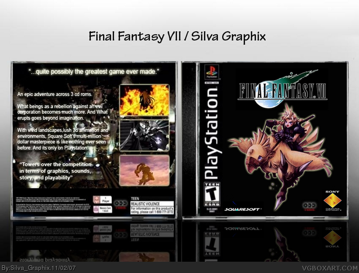
Im new to box art but not photoshop=]
Im trying to get a portfolio done with box art so give me some advice to help me succeed, thanks.
p.s. ill be uploading some new art soon.
[ Reply ]
By the way please view in full size =]
[ Reply ]
ok, i have some few suggestions for you. ;)
1- Cloud on the front looks like fan-art. fan art is a big no, unless it looks really similar to the original.
2-Cloud is touching the FF7 logo, distracting the attention from both the logo and cloud, making the box look a bit fuller than it is.
3-the reflection is really big, try going into gradient mask, than just make a line with the gradient tool, switch back to normal mode, and delete..
4-lower the opacity of the reflection. it's too visible.
5-stick to a color scheme, you've picked white on the front, and black for the back,whereas both white or both black would look better.
You have some nice skills, keep it up.
[ Reply ]
Hey thanks, yea i no i made the reflection big i ment to do that, but your right it shoudnt be that big, and thanks for the advice ayron :P
[ Reply ]
#4, you're welcome.if you need anything pm me , i'll be glad to help.
[ Reply ]
thanks :] im workin on an update with a black front. should be done soon.
[ Reply ]
Not bad for a first. Take Ayron's suggestions.
[ Reply ]
update =]
[ Reply ]
#8, i made the front black so it matches.=]
[ Reply ]
it's hard to keep a black box simple...
may i suggest adding a background on the front?
[ Reply ]
not bad. not bad at all. toning down the outer glow would make this look better. sony logo seems squished. otherwise...very nice for a first :)
[ Reply ]
Hey thanks ladykiller your support means alot, =]
[ Reply ]
The back is nice, but the front is too plain.
[ Reply ]
yea i know, i tried to keep it simple since most final fantasy game covers are like that, =]
[ Reply ]
last version was a bit blury so i made this a PNG file to make it look better. ;p
[ Reply ]
Wow Silva Graphix! This is great! The back is fine, but I'm not so sure about the front. It's a bit too plain for my tastes. Maybe if you added a background, it would look less bland. Good box, especially for a first. Welcome to the site. 4/5
Edited at 1 decade ago
[ Reply ]
#16, hey thanks i know that front is a bit plain, i tried to keep it simple like most of the ff boxes. and i like this site, lots of good boxes i have seen.
[ Reply ]
Oh, i forgot, Welcome to the site Silva ^^
Here are some helpfull links:
official cover site, good for summaries etc. www.cdcovers.cc
A great render site, you might've seen it. www.planetrenders.net
A nice wallpaper site, be sure to edit though. www.gamewallpapers.ru
Hope that helped.
Greetings,
-Ayron
[ Reply ]
I like it but i think the front could use a image other that black.
[ Reply ]