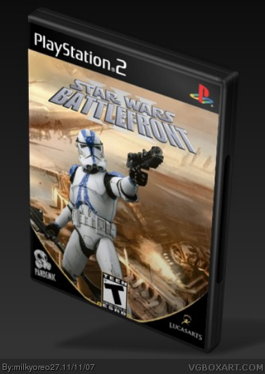
Why is the ESRB logo in the middle? The Pandemic logo shouldn't be there. 'Cause that looks stupid. Other than that and the 3D it's probably your best. 3.5/5
1) Age Rating should be on left hand side.
2) Either change the Pandemic logo to be on the right hand side of the cover and in its usual yellow colour or remove it completely and put it on the "invisible" back cover.
3) Change the presentation of the box.
4) Make the "III" clearer.
well, I don't like the logo, the III in it looks nothing like what it should be. The teen logo at the bottom shouldn't be touching the bottom of the box, and it should be on the left hand side anyway, it looks too weird there, and I don't think you can move it around from where it's supposed to be:P but yeah, also your pic looks too wallpapery, and uhh, mines better :D (jk, I'm not that mean, but really, work on the presentation also)
another thing, if the box is leaning foreward, shouldn't the shadow be under it?
#3, thanks, i tried 6 and 7 but I could not find a way to uploaded an image for the side, if you can help me with that part, then this will be updated right away
#8, the logos the normal (and standard) one, and.. of course i could move it around.. just cause i dont use GIMP doesnt mean Paint.NET is bad...
well.. im just gonna play around with all the suggestions people gave me for my next box.... hm... what should it be....
well, I actually meant the roman numerals looked too solid and not-like-the-actual-thing-ish as you complained about on MY battlefront 3 box, it doesn't look like the actual box, it's just a picture of one of the clones, and that's already been done on the actual battlefront 2 box, and they did it much better, so before pointing out that I have a speck of dust in my eye, get rid of the log in yours.
look man, just because I did not like yours too much doesn't mean you and i hate each other, just take it easy. If someone gives me a 3/5, thats their business, their opinion, ok? so just take it easy with the whole my battlefront is better and yours sucks and has everything wrong, i wasnt being mean with the comments on yours...
just stop with the crappy comments about your battlefront, i dont care about your battlefront, k? if you really want i could comment on yours a say 5/5, i dont care!
ok, firstly, t'sounded like you were sayin that yours would be a lot better than mine, I don't know who brought this whole thing up, I think it was that iamhunter guy, but anyways, yeah, I don't want to fight anymore, I thought I heard you say that yours was a lot better than mine, but I guess that was just that other guy's :\ whatever. truce.

 Star Wars Battlefront III Box Cover Comments
Im finally done, this took me a while, and this is my best Battlefront III yet! Please rate
[ Reply ]
Why is the ESRB logo in the middle? The Pandemic logo shouldn't be there. 'Cause that looks stupid. Other than that and the 3D it's probably your best. 3.5/5
[ Reply ]
That angle isn't the best. I can see you used Imandix. Might I suggest using illisitration 6 or 7?
[ Reply ]
you should change the presentation.
[ Reply ]
i have school now, but after ill look around and see whats better
i think it looks pretty interesting with the ESRB in the middle and the Pandemic in it's place
Edited at 1 decade ago
[ Reply ]
Well, Pandemic is already bought by EA so I think the devs of Renegade Squadron most likely will do this one.
[ Reply ]
1) Age Rating should be on left hand side.
2) Either change the Pandemic logo to be on the right hand side of the cover and in its usual yellow colour or remove it completely and put it on the "invisible" back cover.
3) Change the presentation of the box.
4) Make the "III" clearer.
[ Reply ]
well, I don't like the logo, the III in it looks nothing like what it should be. The teen logo at the bottom shouldn't be touching the bottom of the box, and it should be on the left hand side anyway, it looks too weird there, and I don't think you can move it around from where it's supposed to be:P but yeah, also your pic looks too wallpapery, and uhh, mines better :D (jk, I'm not that mean, but really, work on the presentation also)
another thing, if the box is leaning foreward, shouldn't the shadow be under it?
Edited at 1 decade ago
[ Reply ]
#3, thanks, i tried 6 and 7 but I could not find a way to uploaded an image for the side, if you can help me with that part, then this will be updated right away
#8, the logos the normal (and standard) one, and.. of course i could move it around.. just cause i dont use GIMP doesnt mean Paint.NET is bad...
well.. im just gonna play around with all the suggestions people gave me for my next box.... hm... what should it be....
Edited at 1 decade ago
[ Reply ]
well, I actually meant the roman numerals looked too solid and not-like-the-actual-thing-ish as you complained about on MY battlefront 3 box, it doesn't look like the actual box, it's just a picture of one of the clones, and that's already been done on the actual battlefront 2 box, and they did it much better, so before pointing out that I have a speck of dust in my eye, get rid of the log in yours.
[ Reply ]
look man, just because I did not like yours too much doesn't mean you and i hate each other, just take it easy. If someone gives me a 3/5, thats their business, their opinion, ok? so just take it easy with the whole my battlefront is better and yours sucks and has everything wrong, i wasnt being mean with the comments on yours...
just stop with the crappy comments about your battlefront, i dont care about your battlefront, k? if you really want i could comment on yours a say 5/5, i dont care!
Edited at 1 decade ago
[ Reply ]
ok, firstly, t'sounded like you were sayin that yours would be a lot better than mine, I don't know who brought this whole thing up, I think it was that iamhunter guy, but anyways, yeah, I don't want to fight anymore, I thought I heard you say that yours was a lot better than mine, but I guess that was just that other guy's :\ whatever. truce.
[ Reply ]
yeah, this argument was stupid, lol
i like your new box, but just change the cover, the force unleashed isnt about jedi
[ Reply ]
why is the case orange?
Edited at 1 decade ago
[ Reply ]
hehe... this box was bad... better now though...
[ Reply ]
good but blurry
[ Reply ]