[ Buy Project Goth... at Amazon ] By MugglesMan111 38 on November 15th, 2007 No Printable Available [ Box updated on November 15th, 2007 ] [ original ] Project Gotham Racing 4 Box Cover Comments Comment on MugglesMan111's Project Gotham Racing 4 Box Art / Cover. Cancel Reply MugglesMan111 38 [ 1 decade ago ] credit to Techne for amazing temp so, here it is. as always, comments and favs are well appreciated :) Edited at 1 decade ago [ Reply ] xIAMHUNTERx 43 [ 1 decade ago ] o.O Very nice. Missing a Bizarre logo, though. And something about the back just doesn't work for me... Meh. [ Reply ] Infamous Stick 17 [ 1 decade ago ] #2, I agree, but the front is awesome. 4/5. [ Reply ] Iron Man 14 [ 1 decade ago ] #2, agreed. I don't like the back, but the front kicks ass, just add the Bizarre dev logo like HUNTER said and the front will kick double ass. 4/5 [ Reply ] MugglesMan111 38 [ 1 decade ago ] guys, what is wrong with the back thats that bad. i mean suggestions would be nice. [ Reply ] xIAMHUNTERx 43 [ 1 decade ago ] There's also some problems with the temp cutting... :\ [ Reply ] MugglesMan111 38 [ 1 decade ago ] #6 fine ill fix that, i didnt think the box was THAT bad... UPDATE: i fixed the temp cutting problems but i couldn't find a high res bizzare logo Edited at 1 decade ago [ Reply ] MugglesMan111 38 [ 1 decade ago ] alast, again, spammers rejoice, boxes with effort are pushed to the side for, jericho, and jericho again. where have all the good folks gone. [ Reply ] Iron Man 14 [ 1 decade ago ] #8, most of them found lives away from here, so the ones that don't have a life decided to blow there lives away by spamming websites... [ Reply ] xIAMHUNTERx 43 [ 1 decade ago ] #7, It's not bad at all. It's just those very minor flaws. Have you looked around for a PGR fan site kit? Those usually have hi-res logos. [ Reply ] Ayron 47 [ 1 decade ago ] #8, buried under spammers. anyways,i faved this. you deserve more than this. [ Reply ] MugglesMan111 38 [ 1 decade ago ] #11 thanks mate. [ Reply ] MugglesMan111 38 [ 1 decade ago ] i added what i could find of a bizarre logo. tell me what ya think [ Reply ] xIAMHUNTERx 43 [ 1 decade ago ] Looks a lot better now. However... I hate to be nitpicky, but the Bizarre logo isn't fully cut out. <___> [ Reply ] MugglesMan111 38 [ 1 decade ago ] #14 i know, but i could not seem to cut it out, so...yea [ Reply ] Sp-6 40 [ 1 decade ago ] i think the bizarre logo should be cut out on the front and inverted on the back. besides that i like it, the front is perfect [ Reply ] MugglesMan111 38 [ 1 decade ago ] UPDATE: because of popular demand, i scrapped the back completely [ Reply ] PuzzleMan1337 5 [ 1 decade ago ] Poor Nicks. I faved for joo. [ Reply ] MugglesMan111 38 [ 1 decade ago ] RIP-PGR4 by mugglesman111 beloved spam deflector, no comment master, and meh. [ Reply ] xIAMHUNTERx 43 [ 1 decade ago ] Hey now. Faved, because it looks a lot better without the back. Not that the back wasn't good, just... It looks better with the front and spine. [ Reply ] MugglesMan111 38 [ 1 decade ago ] #20 thanks dude [ Reply ] TrevOwnz 42 [ 1 decade ago ] Pretty sweet. [ Reply ]

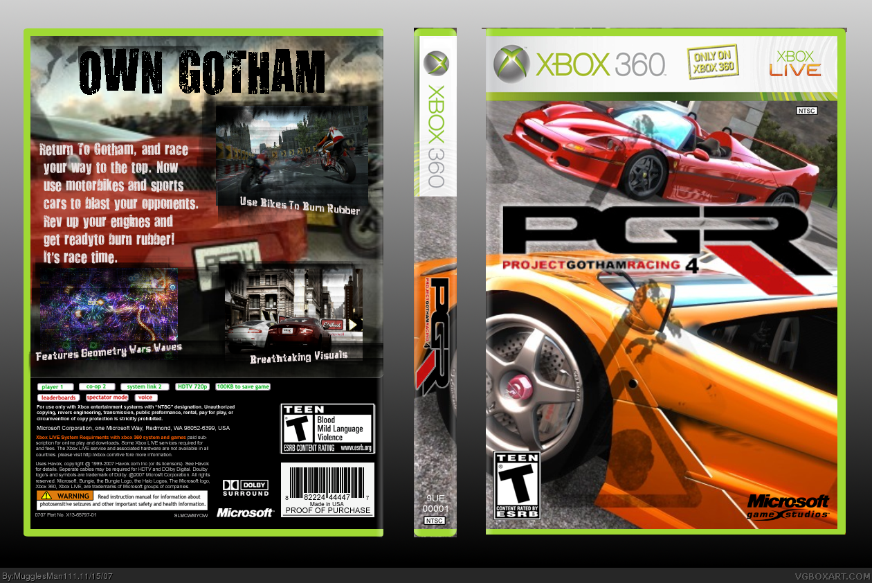
 Project Gotham Racing 4 Box Cover Comments
credit to Techne for amazing temp
so, here it is. as always, comments and favs are well appreciated :)
Edited at 1 decade ago
[ Reply ]
o.O Very nice. Missing a Bizarre logo, though.
And something about the back just doesn't work for me... Meh.
[ Reply ]
#2, I agree, but the front is awesome. 4/5.
[ Reply ]
#2, agreed. I don't like the back, but the front kicks ass, just add the Bizarre dev logo like HUNTER said and the front will kick double ass. 4/5
[ Reply ]
guys, what is wrong with the back thats that bad. i mean suggestions would be nice.
[ Reply ]
There's also some problems with the temp cutting... :\
[ Reply ]
#6 fine ill fix that, i didnt think the box was THAT bad...
UPDATE: i fixed the temp cutting problems but i couldn't find a high res bizzare logo
Edited at 1 decade ago
[ Reply ]
alast, again, spammers rejoice, boxes with effort are pushed to the side for, jericho, and jericho again. where have all the good folks gone.
[ Reply ]
#8, most of them found lives away from here, so the ones that don't have a life decided to blow there lives away by spamming websites...
[ Reply ]
#7, It's not bad at all. It's just those very minor flaws.
Have you looked around for a PGR fan site kit? Those usually have hi-res logos.
[ Reply ]
#8, buried under spammers.
anyways,i faved this.
you deserve more than this.
[ Reply ]
#11 thanks mate.
[ Reply ]
i added what i could find of a bizarre logo. tell me what ya think
[ Reply ]
Looks a lot better now. However... I hate to be nitpicky, but the Bizarre logo isn't fully cut out. <___>
[ Reply ]
#14 i know, but i could not seem to cut it out, so...yea
[ Reply ]
i think the bizarre logo should be cut out on the front and inverted on the back.
besides that i like it, the front is perfect
[ Reply ]
UPDATE: because of popular demand, i scrapped the back completely
[ Reply ]
Poor Nicks. I faved for joo.
[ Reply ]
RIP-PGR4 by mugglesman111
beloved spam deflector, no comment master, and meh.
[ Reply ]
Hey now.
Faved, because it looks a lot better without the back. Not that the back wasn't good, just... It looks better with the front and spine.
[ Reply ]
#20 thanks dude
[ Reply ]
Pretty sweet.
[ Reply ]