Maybe a gradient over the background, and than a hard light overlay (I hope CS2 can do this too). I think you have to play with gradients (especially deep nightsky blue gradients), so that the screen frames will not protrude in comparisation with the back. I also recommend to make the screens and the screen frames in another shape: like a mushroom, a star, or a goomba. The text on the back could be a little bit smaller so you can move the screens upwards and put text beneath the screens: like outstanding graphics, unbelievable gameplay, etc.
#15, Could you stop that? It's an official piece of artwork that I changed and that's no different from what most of us do. If you look at the background you should be able to spot the changes I made.
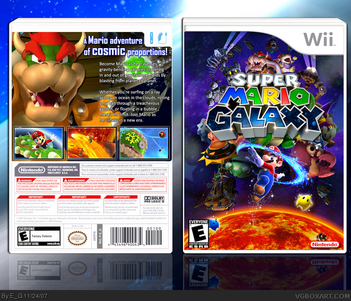
The back is great too, but the only thing the bothers me is white text on the back seems weirdly placed esp. when left justified. Try right justifying it, increasing font size and adding a teeny bit of light blue outer glow to compliment the caption, that would be purrfect.
As always, your work is smooth, clean, and stylish E_G. +fav
Actually boxes are placed in the hall through an automated process, but it hasn't been working properly lately so I have to kick start it. It'll be running every 10mins again once I get a chance to fix it.
I like the back, but the front is just a wallaper link, however, nice postiton of the logo, perfect ESRB size, perfect Nintendo logo placing and size. I'll fave.
 Super Mario Galaxy Box Cover Comments
I recently completed this game so I thought I'll make a box art for it. Please check full size.
[ Reply ]
I love it! Great front cover, I like the overall design. 5/5
[ Reply ]
*bows*
Edited at 1 decade ago
[ Reply ]
I looooooooooooovvvveee iiittt 1000/10
[ Reply ]
Holy shi... this ROCKS! 10/10 + FAVS!
[ Reply ]
You've done it again! Great Job E_G +Fav
[ Reply ]
I definitly love the front, it kicks my ass. But I don't really like the back. However that's not worth arguing. I'll fav this!
[ Reply ]
Thanks and TwilightMystics can you tell me what you don't like about the back? I'd try to improve it.
[ Reply ]
dude this is so a fav, 5/5!
[ Reply ]
Maybe a gradient over the background, and than a hard light overlay (I hope CS2 can do this too). I think you have to play with gradients (especially deep nightsky blue gradients), so that the screen frames will not protrude in comparisation with the back. I also recommend to make the screens and the screen frames in another shape: like a mushroom, a star, or a goomba. The text on the back could be a little bit smaller so you can move the screens upwards and put text beneath the screens: like outstanding graphics, unbelievable gameplay, etc.
[ Reply ]
*kneels Before You* Thats incredible!!! infinite/5
[ Reply ]
#10, Honestly I don't think any of that stuff is that essential, thanks though.
[ Reply ]
The back isnt so great but the front is amazing though you should make mario bigger so he stands out a bit more
[ Reply ]
where did you get the front pic?
[ Reply ]
Sorry yall but the front picture wasnt made by him link
[ Reply ]
OH NOEZ!!! THAT CHANGEZ EVERYTHINGZ!!!! ZOMFG!!!!!one!!!1!!!
Seriously though, I don't really care. So what if he didn't do the front image? It turned out superb.
Another example is finalfantaseer22's Ratchet and Clank Future box.
[ Reply ]
uh, uh, uh, uh, uh...
Uhmazing!!!
Like my jaw dropped.
5/5
[ Reply ]
#15, Could you stop that? It's an official piece of artwork that I changed and that's no different from what most of us do. If you look at the background you should be able to spot the changes I made.
Anyway thanks.
[ Reply ]
Ohhh ok I see now you added smoke in the background or turned it grey ok my mistake
Edited at 1 decade ago
[ Reply ]
#15, you post effortless boxes too, so I wouldn't be talking.
[ Reply ]
great overall box, i love the art you used and everything is great quality but compared to the front, the back seems a little on the plain side.
[ Reply ]
#20, Damn Chibi I already stopped if you got something to say to me PM it to me
[ Reply ]
I hate you so much right now... You're making me look bad.
jk 5/5 +fav
[ Reply ]
#22, I know you did, but check. Awesome box E_G. I love the style. You're making us look like crap! Quit it with the excellent boxes! Lol 5/5
Edited at 1 decade ago
[ Reply ]
love it! This should definetly be the official one :D 5/5 +fave
[ Reply ]
GOD DAMMIT! I was gonna use this art. Well this box owns
fav.
[ Reply ]
THIS IS A WALLPAPER
edit: and you cut Kamella's face, dude, you make great boxes, but this one is just a walpaper... And i hated de back, just the text is cool.
Edited at 1 decade ago
[ Reply ]
#27, This has already been discussed. He edited it alot and thats all that matters.
[ Reply ]
#26, rofl. Well, ya gotta be quicker next time Ninja!
[ Reply ]
Well its not about who is the first one to use a new piece of artwork, but how you use it.
In this case E_G used it well.
[ Reply ]
your best yet. fav
[ Reply ]
That's fine box. Back could be better but it's good too :)
[ Reply ]
#30, I know but I hate using the same blatant art that makes it look the same and people start bitching thats you just copied.
[ Reply ]
holy. crap. +fav
[ Reply ]
Nicely done my friend.
*golf claps*
[ Reply ]
audible gasp!
+fav
[ Reply ]
The front is ABSOLUTELY gorgeous.
The back is great too, but the only thing the bothers me is white text on the back seems weirdly placed esp. when left justified. Try right justifying it, increasing font size and adding a teeny bit of light blue outer glow to compliment the caption, that would be purrfect.
As always, your work is smooth, clean, and stylish E_G. +fav
[ Reply ]
wonderbah
5/5 +
[ Reply ]
I know I've already ocmmened but it's hust THAT amazing! This is one of my favorites of all time!
[ Reply ]
I hate you ! I was gonna take the front to make a box for it :p
[ Reply ]
man this is miles better than official. Faved.
[ Reply ]
26 faves? This should be in the Hall.
[ Reply ]
Absolutely beautiful. The official is awful, and this is leagues better. 5/5 + fav.
Wait, why isn't this in the Hall yet?
[ Reply ]
#42, it will, just wait.
[ Reply ]
#43, Maybe Reed has to put them in manually?
[ Reply ]
#45, yeah. They don't automatically go into the Hall. It's when Reed's on and decides to put them in
[ Reply ]
#45, I'm pretty sure he does.
[ Reply ]
this is amazing, i like it more than the official
and this has 28 favs already....phew
Edited at 1 decade ago
[ Reply ]
HALL OF FAME !!!!!!!!!!!!!!!!!!!!!
[ Reply ]
good front wallpaper lol. whatever. it looks pretty. hate the back. bowser is too big. he looks too artificial.
[ Reply ]
5/5 +fav and congrats for being in the hall of fame =D
[ Reply ]
Well done you eletric general.
I'm pride of you.
*YB goes to Hug E_G*
*E_G Pushes Him Away*
*YB gets a NoseBleed And starts to cry*
[ Reply ]
#52, ummmm that was wired O.o
[ Reply ]
#52, Are you a girl ? lol
[ Reply ]
Actually boxes are placed in the hall through an automated process, but it hasn't been working properly lately so I have to kick start it. It'll be running every 10mins again once I get a chance to fix it.
[ Reply ]
#54, nope im all dude!
lool
[ Reply ]
The cover looks fantastic, but as always, the back just doesn't compare to the front.
[ Reply ]
I love the front a lot and the screen shots on the back.
Maybe you should have updated your other one.
Edited at 1 decade ago
[ Reply ]
this is awesome dude! how did you do it?
[ Reply ]
Thanks, I might update it later but I'm tired now.
[ Reply ]
Man! I can't get enough of this box!
[ Reply ]
Best Mario box ever! nuff said +fav
[ Reply ]
congrats on HOF. now i gotta try madden 08
[ Reply ]
OMG! I never thought I'd see a super mario galaxy box without the overused wallpapers! This is designed so well I'm speechless! 5/5 +fave.
[ Reply ]
WOW! This is one of the best boxes I have ever seen on this site! 10/10
[ Reply ]
<3
[ Reply ]
I like how you put everything together yourself.
[ Reply ]
This is awesome!
No.... THIS.. IS... EPIC!
Gah. 300 jokes are so lame. Anyways, awesome box art. Better than the official by far.
[ Reply ]
Awesome. Great front cover.
[ Reply ]
sorry if i'm acting like a foo' but the cover is just a pic from google and a logo. here link link
anyway good screenshots...
Edited at 1 decade ago
[ Reply ]
Edited at 1 decade ago
[ Reply ]
Check your PMs, thanks.
[ Reply ]
Edited at 1 decade ago
[ Reply ]
Excellent. Fave
[ Reply ]
Thats pretty good.
[ Reply ]
I think this is better than the official.
[ Reply ]
#76 i agree
best Galaxy box on this site
5/5!!!!!!!
[ Reply ]
Oh god man.
This is the best box on the site man.
GG
[ Reply ]
great box from a great artist
[ Reply ]
I DON'T LIKE IT AT ALL, IT SUCKS!!!!!!!!!!
unoriginal and overdone
i have a right to my own opinion
[ Reply ]
I like the back, but the front is just a wallaper link, however, nice postiton of the logo, perfect ESRB size, perfect Nintendo logo placing and size. I'll fave.
[ Reply ]
oh wait, sorry, you edited it. Oops... I'm embarrased...
[ Reply ]
89th fav! This is soo 10/10! ALL HAIL E_G!
[ Reply ]
Wait... Do my eyes deceive me, or did E_G make hof with..... A WALLPAPER!?!?
Edited at 1 decade ago
[ Reply ]
#84, WHAT!?!?!? NO WAY, I DON'T BELIEVE YOU!!!
[ Reply ]
The back is decent, while not extremely creative, there isn't anyhting wrong with it.
But the front is a esrb, logo, dev, and a wallpaper link
[ Reply ]
#86, WHAT, NO WAY I TOTALLY DIDN'T KNOW THAT EVEN THOUGH ABOUT 50 PEOPLE ALREADY SAID IT I'M REMOVING MY FAV NOW! >:( >:( >:(
[ Reply ]
94 favs... and no Masterworks?
[ Reply ]
WTH
I just did the 100th fave
and still no Masterworks
[ Reply ]
Sorry, but this box deserves nowhere near 100 faves. 'Nuff said.
[ Reply ]
#90, Agreed.
[ Reply ]