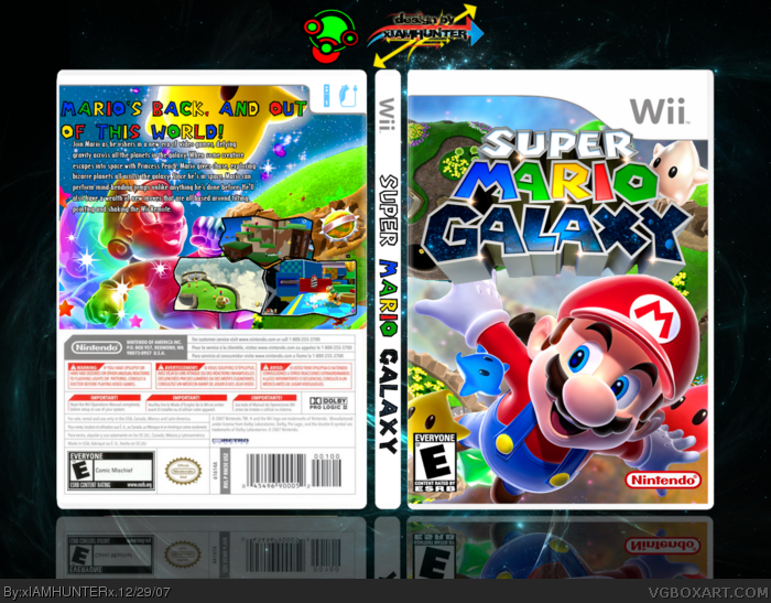
My only problem is how the Wii temp is cutting off some of the logo. I also think it would look better if Marios head was overlapping the logo. (That's just a suggestion though) 4.8/5 still.
Two things kinda killed it for me though, first, I don't like the spine text at all, the drop shadow on it makes it stand out more than it should and the 3 words are too different in terms of color and style (even though they mimic the actual logo, I don't think that was the way to go). The back is nice as the front and I actually like the screenshot layout on this if nothing else. but the second thing is that the back text could be much better, the tagline works with the style and all, but the the text below that....not so much.
EDIT:
P.S. I know I'm sounding very harsh when it comes to my criticisms on you now, more than before. But you're improving as an artist in my opinion and as such, my standards for your work also increases ;)
#34, Thanks. I tried to do something a little different and brighter than all the other Galaxy boxes; the thing I noticed was that they all had that dark space theme. I guess it worked!
Seriously though, did you know you can delete any versions that were added within the last 30 minutes? delete the last 2, then upload version 6 again, but as version 5.
 Super Mario Galaxy Box Cover Comments
Yeah... e___e
[ Reply ]
Nothing new, but it's alright.
[ Reply ]
Well, what can ya do? Pretty much every Galaxy pic out there has been raped to death.
[ Reply ]
That's true, maybe a back can do it justice? *cough* HoF *cough*, because this has potential.
[ Reply ]
the nintendo logo is huge...but i really like this, its good. i also just got the game tonight :)
[ Reply ]
Yeah, I realized that after I posted it... >__<
#4, I'm thinking about it.
[ Reply ]
Colorful, shmexy wexy! 5/5 +Fav
P.S. I've just kinda been givin' out faves today, but that doesn't mean I'll just favorite your box if you ask me to.
[ Reply ]
Thank ya.
THE BACK'S COMING, GUYS.
[ Reply ]
Alrighty, I'm updating this one part by part. Here's the front and spine. Working on the back now.
[ Reply ]
#8, WOOT! Be sure to make the back as colorful as the front. :D
[ Reply ]
My only problem is how the Wii temp is cutting off some of the logo. I also think it would look better if Marios head was overlapping the logo. (That's just a suggestion though) 4.8/5 still.
[ Reply ]
I'll take that under advisement.
[ Reply ]
#12, are you still working on the back, or are you not working on it any more?
Edited at 1 decade ago
[ Reply ]
No, I'm working on it.
Alright, per TwistedTinkerToy's suggestions, I made Mario overlap the logo overlap the template. So yesh. Hope that looks better.
[ Reply ]
#14, when you update it with the back, be sure to work on that star in the corner, his arm is going off of the template a little.
[ Reply ]
>__< I noticed that when I first uploaded the box. I deleted it to fix that. Look at V1, it should be fixed. I don't know what happened.
[ Reply ]
Added that back that you all are so stoked about.
[ Reply ]
<__< Nobody?
Thanks for the faves, everyone...
[ Reply ]
its not horrible, but i think just about everyone has seen enough mario galaxy boxes. 3/5
[ Reply ]
That didn't sound like a backhanded compliment at all.
[ Reply ]
8=======> +FAV
(once I get Techne back)
[ Reply ]
I like everything except for the header on the back. I know it's the mario font but it looks bad and doesn't fit.
[ Reply ]
#21, XD Thanks.
#22, I'll see what I can do. Is it the font itself, or the coloring, or what?
[ Reply ]
The font. I don't like it. Try with other colors too, but it's up to you.
[ Reply ]
Aightee. I couldn't really find a font that fits... E__e
[ Reply ]
#19, I think you're jealous.
[ Reply ]
Lawl. Thanks, I think.
[ Reply ]
looks great especially the front.
Two things kinda killed it for me though, first, I don't like the spine text at all, the drop shadow on it makes it stand out more than it should and the 3 words are too different in terms of color and style (even though they mimic the actual logo, I don't think that was the way to go). The back is nice as the front and I actually like the screenshot layout on this if nothing else. but the second thing is that the back text could be much better, the tagline works with the style and all, but the the text below that....not so much.
EDIT:
P.S. I know I'm sounding very harsh when it comes to my criticisms on you now, more than before. But you're improving as an artist in my opinion and as such, my standards for your work also increases ;)
Edited at 1 decade ago
[ Reply ]
<__< I tried to make the spine text look like the logo on the front... Guess it phailed. Lawl.
I'm working on another box right now, but I'll fix those things as soon as I get the chance.
[ Reply ]
not bad, this is pretty good!
[ Reply ]
Thank ya! ^__^
[ Reply ]
#31, i cant get over this this rocks! im gonna fave
[ Reply ]
Why thank you.
[ Reply ]
What really got me was all the colors, it's so colorful! It's awesome! :)
[ Reply ]
#34, yeah, the colors on the back lure you in.
[ Reply ]
#34, Thanks. I tried to do something a little different and brighter than all the other Galaxy boxes; the thing I noticed was that they all had that dark space theme. I guess it worked!
[ Reply ]
#36, agreed.
[ Reply ]
Anyone else?
[ Reply ]
Pretty sweet.
[ Reply ]
Thanks, dude.
[ Reply ]
pretty darn amahzing.
-walks on by-
-turns around-
-throws a fav in your hat-
-whistles and moves on-
[ Reply ]
Whoa dude... Thanks a lot. That means a ton.
[ Reply ]
Man... I only need nine more...
[ Reply ]
#21, LIAR! *slap*
[ Reply ]
I think you should take off the drop shadow from the sidebar of the gamebox. It makes it look like its not on the box
[ Reply ]
Well, there's really nothing I can do about it now...
[ Reply ]
Now, however... I fixed the spine. Wait... *notices something*
ARGHAFLAOMBALGOLBLAS *eats computer* STUPID STARM!
[ Reply ]
Dood man dat str is stikin out temp u get 0 out 5
wait u fix it u get 1000 out 5
Seriously though, did you know you can delete any versions that were added within the last 30 minutes? delete the last 2, then upload version 6 again, but as version 5.
Edited at 1 decade ago
[ Reply ]
Lawlercaust!
[ Reply ]