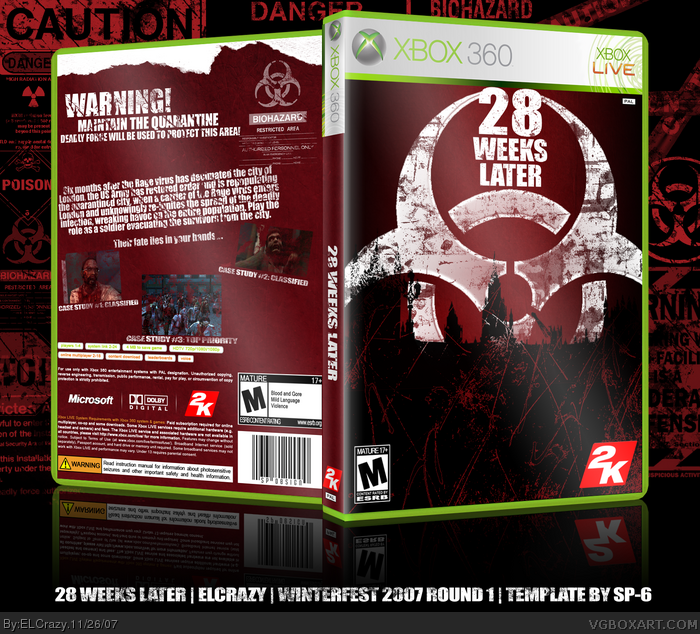
This box reminds me of something Brettska would do, just because of the glossy look and the black/red color scheme. Still all together nice. The back just felt so empty.
Wonderful colour scheme used. Lovely, deep reds: perfectly fitting.
The back, however, is rather empty but I say "it's just the stress of the competition..."
 28 Weeks Later Box Cover Comments
My comp box.
I will lose.
[ Reply ]
This box reminds me of something Brettska would do, just because of the glossy look and the black/red color scheme. Still all together nice. The back just felt so empty.
[ Reply ]
Wonderful colour scheme used. Lovely, deep reds: perfectly fitting.
The back, however, is rather empty but I say "it's just the stress of the competition..."
[ Reply ]
It's pretty cool but I dislike the back. 4/5 +Not your best.
Edited at 1 decade ago
[ Reply ]
Thanks guys, and yeah TCM, most probably it's the stress.
[ Reply ]
the pics are a little small in the back, and I'm not sure how I feel about that open space at the bottom of the front, it's pretty good though :)
[ Reply ]
Thanks.
And thanks for the favs. =D
[ Reply ]
great job mate, keep up your reputation ;)
[ Reply ]
#8, lol thanks :)
[ Reply ]
I like it but the back seems a little empty.
[ Reply ]