Credits are on it, please rate, comment, and enjoy. Also, thanks to everyone in the Forums who helped my with the important decision of what color logo I should do lol
#4, this is just a Bully not exclusive for PS2, its unofficial
#5, if you dont like it and think its blurry, then just dont comment. we dont want to hear you complaining that you think its boring. I appreciate you commenting, but if you dont have any good constructive criticism about this, then just dont comment
 Bully Box Cover Comments
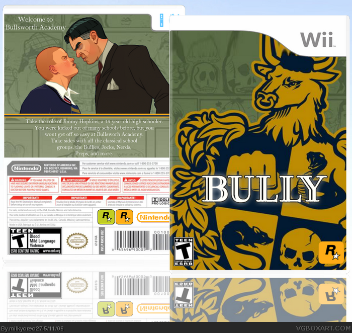
My new Bully for the Wii box
Credits are on it, please rate, comment, and enjoy. Also, thanks to everyone in the Forums who helped my with the important decision of what color logo I should do lol
[ Reply ]
Hey, this isn't bad, but it's really blurry in full. 4/5
[ Reply ]
This isn't too bad, blurry though.
[ Reply ]
it's ok, too zoomed in, boring and blurry, and it's called "Bully: Scholarship Edition" btw.
[ Reply ]
I don't see anything Wow or Cool about this box. Its very plain and boring. I can see you didn't put much effort in it. Go for a back.
[ Reply ]
#4, this is just a Bully not exclusive for PS2, its unofficial
#5, if you dont like it and think its blurry, then just dont comment. we dont want to hear you complaining that you think its boring. I appreciate you commenting, but if you dont have any good constructive criticism about this, then just dont comment
Edited at 1 decade ago
[ Reply ]
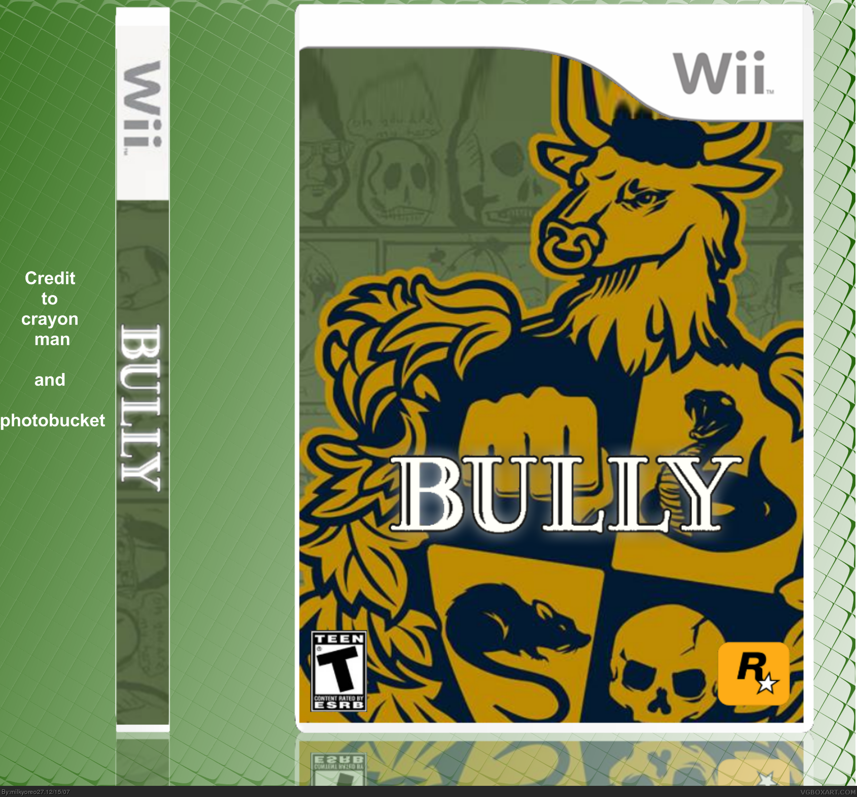
Okay then, I put in a new template and added a back, so please rate and comment, favorites are always appreciated.
[ Reply ]
its alright!!!
[ Reply ]