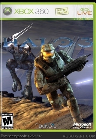
It looked better in the forums, minus the 3D format. Maybe it looked better in the forums with the 3D because I could barly see the picture... hmm... 3/5
version 2. i threw out the back 'cause you guys dont like it. and i de-negated the logo and changed the colours back to normal. hope you like this one better.
 Halo 3 Box Cover Comments
Don't delete this again!
[ Reply ]
uhmm.. ew.
nothing about this box looks right.
Edited at 1 decade ago
[ Reply ]
ok im getting p'Oed. its not uploading right. well, whatever. DEAL WITH IT. cred goes to crayonman for the box temp
[ Reply ]
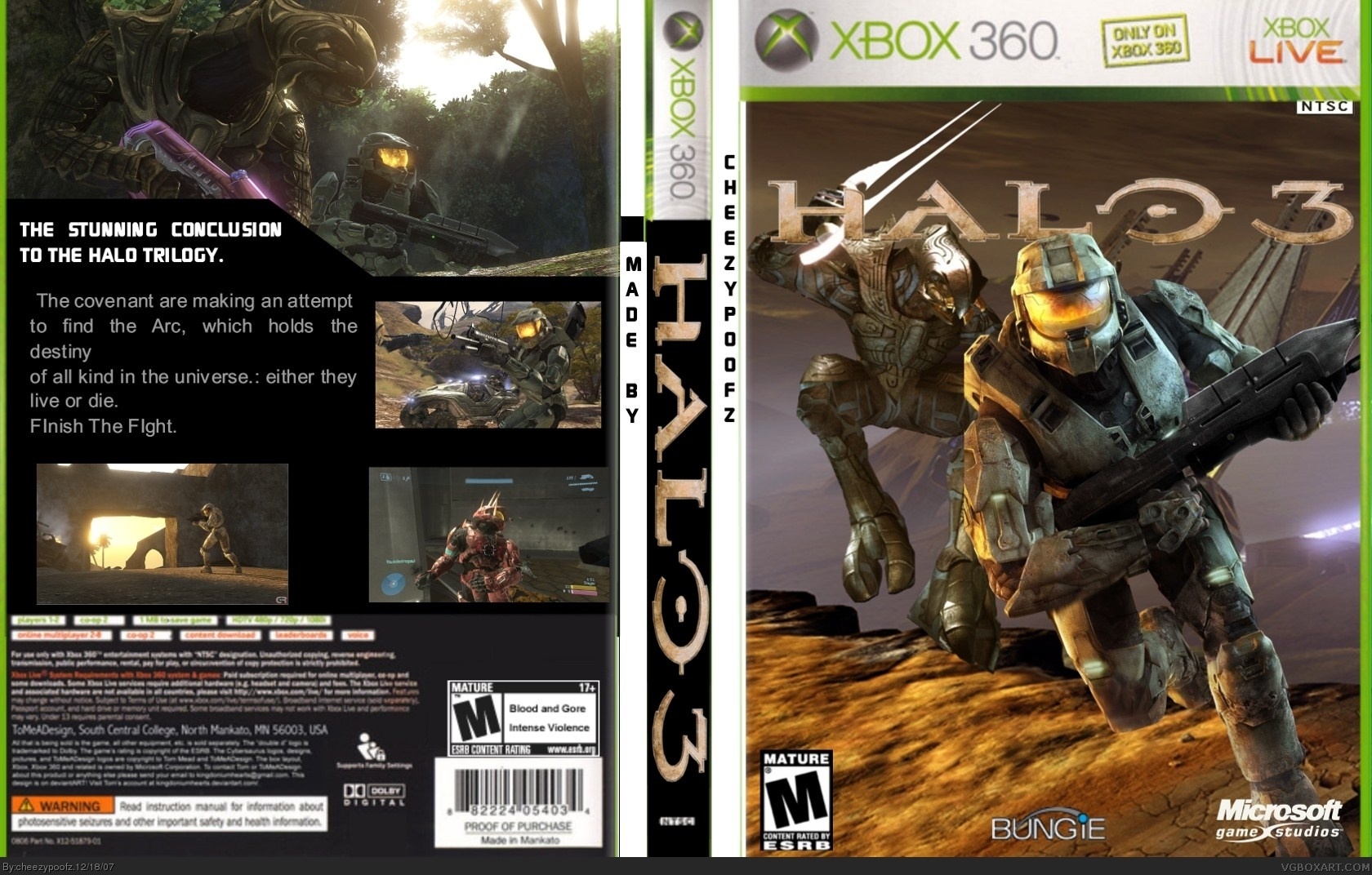
The front is ok but the back is bad. Read posts on your first box to see what I mean.
EDIT: Nevermind.
It's boring.
No screenshot borders.
Screenshots are different sizes.
Bad font.
Text is allover the place.
Spine is boring.
Temp is messed up.
2.5/5
Edited at 1 decade ago
[ Reply ]
#1, why? it wont upload
[ Reply ]
#4, it will look better once i get the description thing for the back.
[ Reply ]
It looked better in the forums, minus the 3D format. Maybe it looked better in the forums with the 3D because I could barly see the picture... hmm... 3/5
[ Reply ]
ive been experimenting with editing colours and lighting so thiss is my first try.
[ Reply ]
version 2. i threw out the back 'cause you guys dont like it. and i de-negated the logo and changed the colours back to normal. hope you like this one better.
EDIT: ill make a better back later.
Edited at 1 decade ago
[ Reply ]
The update doesn't look bad actually. HOWEVER the Bungie logo is choppy and the template is very blurry. 3/5
[ Reply ]
nice
[ Reply ]