[ Buy Darth Wario at Amazon ] By oxol 24 on December 23rd, 2007 No Printable Available Darth Wario Box Cover Comments Comment on oxol's Darth Wario Box Art / Cover. Cancel Reply oxol 24 [ 1 decade ago ] Thanks to HalfSwiss for the idea, www.rabittooth.com for picture of maul and www.dafont.com for the text and google for the rest. Edited at 1 decade ago [ Reply ] HalfSwiss 43 [ 1 decade ago ] Better than mine, hands down. Nice job! [ Reply ] Vengeance 40 [ 1 decade ago ] well, it aint too bad for an edit, butit's not really that funny, because the joke was used like, yesterday. [ Reply ] oxol 24 [ 1 decade ago ] i know. Edit: #2. Thanks. Edited at 1 decade ago [ Reply ] frenchboy1 34 [ 1 decade ago ] Yep, I go with Vengeance. Also, the logos are too small... [ Reply ] RobbanFoxer 1 [ 1 decade ago ] not funny and the "I" look like a "L" uppsidedown [ Reply ] oxol 24 [ 1 decade ago ] #6 the starwars font is like that. [ Reply ] maja2 1 [ 1 decade ago ] that is wired [ Reply ] Luigi 28 1 [ 1 decade ago ] Scary... [ Reply ] PhantomXZero 1 [ 1 decade ago ] creepy [ Reply ] wario is great 1 [ 1 decade ago ] ok [ Reply ] Koopaboo123 16 [ 1 decade ago ] thats creepy... but somehow, enjoyable! +fav Edited at 1 decade ago [ Reply ] GrahamZ 40 [ 1 decade ago ] LOLAGE! the shadow needs a mustache too... [ Reply ] Papermariods 1 [ 1 decade ago ] make his face chubbier and its perfect [ Reply ] PoP#9 1 [ 1 decade ago ] rofl funny [ Reply ] Bbbbbbbb126 1 [ 1 decade ago ] well i dont know if i like it but i will give it a 6/10 for trying [ Reply ] yoshigod9753 1 [ 1 decade ago ] The head made me laugh! [ Reply ]
 Darth Wario Box Cover Comments
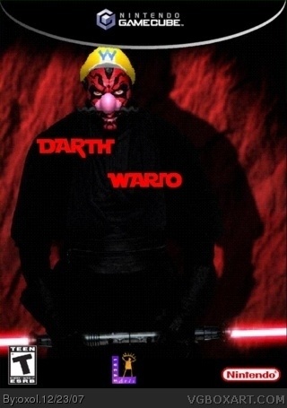
Thanks to HalfSwiss for the idea, www.rabittooth.com for picture of maul and www.dafont.com for the text and google for the rest.
Edited at 1 decade ago
[ Reply ]
Better than mine, hands down. Nice job!
[ Reply ]
well, it aint too bad for an edit, butit's not really that funny, because the joke was used like, yesterday.
[ Reply ]
i know.
Edit: #2. Thanks.
Edited at 1 decade ago
[ Reply ]
Yep, I go with Vengeance. Also, the logos are too small...
[ Reply ]
not funny and the "I" look like a "L" uppsidedown
[ Reply ]
#6
the starwars font is like that.
[ Reply ]
that is wired
[ Reply ]
Scary...
[ Reply ]
creepy
[ Reply ]
ok
[ Reply ]
thats creepy...
but somehow, enjoyable!
+fav
Edited at 1 decade ago
[ Reply ]
LOLAGE!
the shadow needs a mustache too...
[ Reply ]
make his face chubbier and its perfect
[ Reply ]
rofl funny
[ Reply ]
well i dont know if i like it but i will give it a 6/10 for trying
[ Reply ]
The head made me laugh!
[ Reply ]