it's very excelent! you're getting better and better :D it's just the backs, you shouldn't have text over screenshots or pictures, you need to have fitting text, no curly swirvy stuff. It needs to be easy to read, and the screenshots should be bigger than how you have them :) also, for most boxes, you will want to do different points of interests, like bullet points, or bits of text next to different screenshots. Just having a big paragraph isn't advised until you know how to use it :) so there you are. You're second box kirbylore tip post :D This one was small, because you're already great off the bat! Good luck on you're future boxes, I'll be cheering for you :D
I agree with pretty much with #2 and #3. As a n00b artist as well, this is SO good!
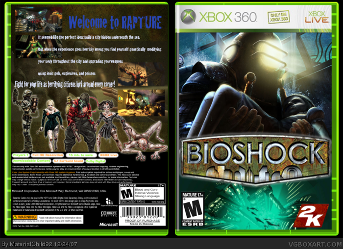
This may just be me, but the words "Welcome to the Rapture" need something. I feel that the blue just doesn't fit. If you don't wanna do that then I suggest stylizing the words, whether it be embossing or what.
 BioShock Box Cover Comments
2nd box on the site. Enjoy... props to Dark Raider for the temp.
Once again, take credit where credit is due.
Thanks :)
-MC
Edited at 1 decade ago
[ Reply ]
Great second box, but.
-The screenshots need borders.
-The back text isn't very good.
-The front is an overused picture.
4/5
[ Reply ]
it's very excelent! you're getting better and better :D it's just the backs, you shouldn't have text over screenshots or pictures, you need to have fitting text, no curly swirvy stuff. It needs to be easy to read, and the screenshots should be bigger than how you have them :) also, for most boxes, you will want to do different points of interests, like bullet points, or bits of text next to different screenshots. Just having a big paragraph isn't advised until you know how to use it :) so there you are. You're second box kirbylore tip post :D This one was small, because you're already great off the bat! Good luck on you're future boxes, I'll be cheering for you :D
Edited at 1 decade ago
[ Reply ]
I agree with pretty much with #2 and #3. As a n00b artist as well, this is SO good!
This may just be me, but the words "Welcome to the Rapture" need something. I feel that the blue just doesn't fit. If you don't wanna do that then I suggest stylizing the words, whether it be embossing or what.
Other than that, wonderful!
[ Reply ]